

InDesign Basics: Paragraph and Character Panels

Working with type in InDesign is as easy as drawing out a text frame with the Type tool and typing away. But if you want to get to the nitty-gritty of styling that text, you’ll need to access the proper panel for that. With type, you’ll actually need to access two: The Character panel and the Paragraph panel. Both panels are located under the Window menu, in the Type & Tables sub-menu. In addition, selecting the Type tool will also switch the Control panel’s content to type-centric input, with one button for character settings and another for paragraph options. Whether you’re working in the Control panel or the two individual type panels, your options are (nearly) the same.
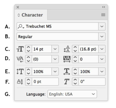
A. Font; B. Font style; C. Font size, leading; D. Kerning, tracking; E. Vertical scale, Horizontal scale; F. Baseline shift, skew (false italic); G. Language
Character Panel
When dealing with character level input, you’ll need to select the individual characters that you want to affect. Now everything you do in the Character panel will change only the selected text. Let’s look at the options. First thing you’ll probably want to pick is a font—or typeface—which you can do by clicking the name pull-down menu. Alternatively, you can click in the box and start typing a font name. The item just below lets you choose a particular style, like bold, italic, book, depending on which fonts you’ve loaded into your system.
The font size box gives you the option of picking a size from the list or entering a custom size. To the right of the font size is the leading (rhymes with “sledding”) value. If you’ve been working in a program like Word, you’ve probably been using “line spacing,” instead. In that situation, the value is generally expressed as single- or double-spacing. In InDesign, leading is expressed in points and you can set an exact amount. By default, the value is set at Auto (whose default is set at 120% of the font size), with the actual value displayed in square brackets. Having that value gives you a great reference point if you want to manually enter a new value.
The next two buttons deal with the spacing between individual characters. So why two different buttons for that? The first button is for kerning—the space between individual letter pairs—and the second is tracking, which adds space between letters uniformly. Both use fractions of a measurement called an “em” (quite literally, the size of the letter m), but don’t stress about that too much. Just know that a lower value will tighten the characters up and a larger one will give you more space between them. To set kerning between two characters, put your cursor between them and change the kerning value. Until you get more comfortable with this, you can simply select all of your text and choose Optical from the pull-down. This usually creates a nice organic flow of how each character relates to its neighbors. Tracking should be used sparingly, but can be used to great effect in small chunks of display text. Don’t use it to make type fit a line more accurately.
I hesitate to tell you about the Vertical Scale, Horizontal Scale, and Skew settings because they distort the letterforms by simply stretching or tilting them. If you need a stretched set of letters, use a condensed or wide typeface, and instead of adding skew, use an italic font. You will have at some point, however, the need to employ the baseline shift. This raises or lowers the baseline (the invisible line text sits on) to float or sink the selected text. Don’t use baseline shift on entire lines or paragraphs, especially if you’re just trying to achieve more breathing room between paragraphs (see “Space Before/After” in the Paragraph panel section).

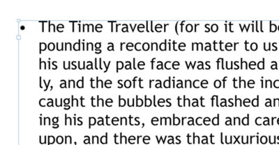
An extreme baseline shift applied to the last bullet
The last item in the Character panel is the Language menu. I wish switching this to something like Polish would magically translate my text for me, but no such luck. Choosing a language here signals InDesign to use the dictionary and hyphenation settings for that particular language. For instance, you might have every other paragraph in Spanish. Select those paragraphs and choose Spanish to have InDesign spellcheck against that dictionary and to hyphenate according to that language’s rules. Speaking of menus, be sure to check out the Character panel menu for access to other character attributes, such as underline options or making the text all caps or superscripted.
Two Handy Preferences
There are a ton of type-related preferences that can be set, but I want to point out only two here. The first one has to do with leading and how that’s assigned. Even if you only have selected a single word, changing leading will affect all the type on that line. While you can’t change that behavior—which is the typical result you’d probably want—you can, however, change it to assign leading paragraph-wide. Select Apply Leading to Entire Paragraphs in the Type pane under Preferences (InDesign > Preferences/Edit > Preferences). In that same pane, you can de-select Triple Click to Select a Line to force a triple click to select the entire paragraph.

A. Alignment options; B. Left indent, right indent; C. First line indent, last line right indent; D. Space before, space after; E. Drop cap lines, drop cap characters; F. Paragraph shading; G. Hyphenation toggle, align to baseline grid toggle
Paragraph Panel
When working with paragraph-wide settings, you only need your cursor in a paragraph (or in a portion of multiple paragraphs) before making selections in the Paragraph panel. With the Paragraph panel open, the first thing you’ll see across the top are a lot of horizontal lines. Those are all of the alignment options. The first three—Align Left, Center, and Right—have one or more “ragged” edges. This type of alignment makes it easier for InDesign to keep whole words together and hyphenate less. If you want more of a “finished” look down both sides of your text, choose one of the next four justified options. The only difference between them is what happens to the last line: left justified, centered, right justified, or fully justified. The last two buttons in this row should be used when your layout has facing pages, as it aligns text based on the spine between pages.

Left, centered, and right aligned text
If you need to make your text a narrower column, but need to keep the text in the same frame, use the next two items: margin left and margin right. These options lets you set a paragraph apart from others around it, such as a pull-quote or bulleted list. You can even incorporate the first line indent (in the next row of buttons) to change up the first line in a paragraph. Use it to indent that first line, instead of using a tab stop. Entering a negative amount in conjunction with an indented left margin gives you hanging text in the first line, as in the “floating” bullet in the image below. Use a negative value in the Last Line Right Indent box to force the last line further to the right than any right indent value you’ve set. An example of this may be in a price list or menu where you want the price to sit out further to the right than the descriptive text.
New InDesign users are often tempted to add space between paragraphs by adding extra returns. This practice is not recommended as you may end up with spaces at the top of a page or column. To give paragraphs some breathing room, use the Space Before and Space After options. If you want to give the appearance of exactly one carriage return, make note of the leading amount in the Character panel and enter that amount in the Space After box—remember to indicate the value in points.
Following down to the next row are two buttons for creating a drop cap at the beginning of the paragraph. The button on the left lets you choose how many lines high the drop cap will be (no need to change its size manually). The right button indicates how many initial characters in the line need to be made into the drop cap, which most often tends to be just one. You can further stylize the look of the paragraph by turning on Shading by ticking the box on the next line. Choose a color from the menu to create a colored background behind the text. If you want a few more options and control, choose Paragraph Shading from the panel menu.
In the last row there is a toggle for hyphenation and baseline grid. The Hyphenate checkbox turns hyphenation completely on or off. For further control over hyphenation settings, choose Hyphenation from the panel menu. The last two buttons let you align your paragraph to the baseline or not. With align turned on, the text—regardless of leading amount—will automatically line up to whatever baseline grid you’ve established in Preferences. Using the baseline grid isn’t something you’re likely to do as you’re just starting out, but feel free to experiment with the toggle on and off.
READY, SET, TYPE
Now that you’ve had a look around the Character and Paragraph panels, you’re ready to start taking control of your text. Be sure to look at the options in the panel menus for even more fine tuning. And remember, most of the options in these two panels can also be accessed via the Control panel, by toggling the Character or Paragraph Formatting Control buttons.
Thanks this was helpful