

InDesign Eye Candy, part 5: Blending a la Mode

For this final installment of the Eye Candy series, let’s take a look at some of the things we can do to alter placed graphics with blending modes. Specifically, let’s focus on Hue, Saturation, and Color.
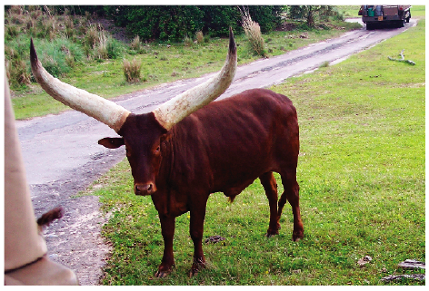
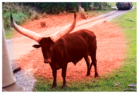
We’ll start with our friend with the silly horns one more time.
Fill a new frame with a solid color.
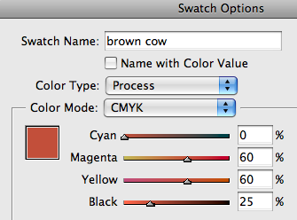
Place that frame on top of the image.
Then change the frame’s blending mode to Hue in the Effects panel.
You get a nice fake duotone effect.

Because we used Hue, the saturation and luminosity values of the original image are kept. So areas that had very little color to begin with, like the horns, rocks, and road, are relatively unaffected.
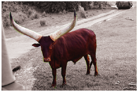
Change the frame’s blending mode to Color.

See how the horns, rocks, and road are much more colorized? That’s because Color = Hue and Saturation. The only part of the original image that’s kept are the luminosity values (the L in LAB color). Overall, the image has a more uniform feel with less contrast. But if that’s what you’re looking for, well, bully for you.
Now change the blending mode to Saturation.

We get the original hues, but a uniform saturation. It’s very noticeable in those areas of low original saturation like the horns, and the dried grass in the background.
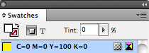
You can blend with a fully saturated color to really take it to the limit. How now, purple cow?

To reduce the freakish effect, just reduce the tint in the Swatches panel.
You can take it all the way down to 0% to completely desaturate the image.

If your image has a clipping path, you can place an unclipped, desaturated copy underneath.
Just be aware that desaturating with blending modes doesn’t by itself produce a true grayscale. If you print or export a PDF, you’ll see you have a 4-color black.
There is at least one way to trick InDesign to making it pure black, but it’s not for the faint of heart (and isn’t worth the trouble if you have Photoshop at your disposal to make a true grayscale). But if anyone’s interested, let me know, and I’ll describe it in the comments.
Don’t forget you can add Effects to the frame that’s controlling the saturation. For example, give it a Gradient Feather.


Play with different shapes and Effects.
Have fun. But blend responsibly. Always blend with Overprint Preview turned on to give you the best idea of the colors you’re making. And avoid the following blending modes when working with spot colors: Difference, Exclusion, Hue, Saturation, Color, and Luminosity. The results won’t be pretty at the printer.

Well, I think it’s time to mooo-ve on. Hope you enjoyed the Eye Candy series.
Holy Cow that was cool;)
I see how you get uniform saturation, but is there any way of getting uniform lightness (or maybe I mean uniform luminosity)?
Jeremy-
Sure, just change the blending mode of the solid color frame to Luminosity. It completely flattens the image into a uniform brightness and the only detail you see is color variation. Similar to looking at a LAB image in Photoshop and turning off the L channel.
Hey, great — thanks!
Mike, stop taking that medication right away please! ;-)
One of my favorite variations on this theme is to put a colored ground under a photograph and use multiply or occasionally luminosity. It can be a terrific way to pull the colors in a layout together, especially when you want the image a little subdued or monotone anyway. Other blend modes can create special, ah, “creative effects,” but they’re more limited in general usefulness.
> There is at least one way to trick InDesign to making it pure black, but it?s not for the faint of heart (and isn?t worth the trouble if you have Photoshop at your disposal to make a true grayscale). But if anyone?s interested, let me know, and I?ll describe it in the comments.
Could you, please? Thanks in advance.
Pablo-
Sorry for the delay in getting back to you.
The trick is this:
1. In Photoshop, create a CMYK profile that will convert all equal amounts of R,G, and B to black. You do this by going to Color Settings > Working Spaces > Custom CMYK and setting the Black Generation to Maximum.
2. Save that profile as “MaxBlack” or something similar and if you’re on a Mac, put it in Library/Application Support/Adobe/Color/Profiles/Recommended. You may also need to relaunch InDesign to get it to see the profile.
3. In InDesign, set your document’s Transparency Blend Space to Document RGB (in the Edit menu).
4. In Color Settings, make sure your CMYK working space is something other than MaxBlack.
5. Export a PDF. In the PDF Export dialog box choose Output > Color Conversion > Convert to Destination, and for Destination choose your custom CMYK profile (MaxBlack).
The resulting grays will be made of only black ink.
WTF! I like your photo styles, but WTF – those big horns. hahaha damn,great picture
WOW! This is one serious bull! Dammit!
hello admin is so good information.. dont forget to check my blogs its also provide information about eyelid lift without surgery ;)