

InType: High-Contrast Fonts

 This article appeared in Issue 113 of InDesign Magazine.
Andrea Leksen explores fonts that create drama and intensity by combining thick and thin strokes.
I don’t know about you, but I love a gorgeous, dramatic, over-the-top, high contrast font for large titles in magazines, on posters, or on a tattoo! There’s something about homing in on that meticulously designed letterform—each curve connecting a thin stroke to a ridiculously thick stroke—that creates drama and intensity (Figure 1). Is it a quick transition or slow? Does the terminal connect back into other letterforms or is it drawn out into an ornate swash that ends like a stunning symphony finale?
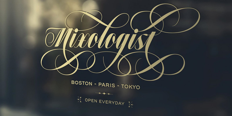
Figure 1. Alejandro Paul’s recent font release, Speakeasy.
Just thinking about it gives me goosebumps.
. . . .
This article is for members only. To continue reading, please sign in, or sign up for a membership today. Thanks for supporting CreativePro! CreativePro membership keeps you up-to-date with the technology, solutions, and resources to strengthen your professional development.
BECOME A MEMBER
For just $6.50/month (billed annually), you’ll get access to valuable benefits, including:
Nice article. Why hasn’t it received more comments?