

Laying Out Basic (non-PDF) Forms Using Tabs

Everyone, at one point or another in his or her career, ends up having to lay out a form something along the lines of this:
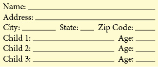
A plain vanilla form
Nothing fancy, just some labels followed by lines on which to write the information. But what is the best way to go about actually setting up those lines?
Note: If you want to learn about how to turn InDesign forms into nifty PDF forms there are numerous articles on this topic.
Everybody seems to make them a little differently, but here are a few different ways to set up those form lines that should fit into anyone’s work styles.
Method 1: Tabs and Character Styles
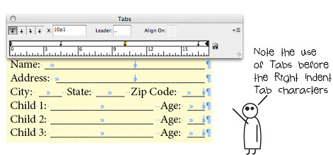
The first method to lay out your form is to use tab stops to set the spacing between the labels and then use a Character Style to apply an underline to the Tab characters.
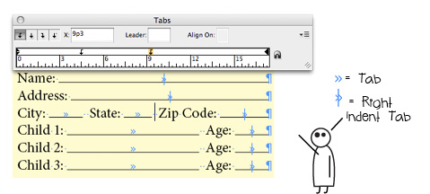
Note: If you want the underline to extend all the way to the right edge of the text column press Shift+Tab to insert a Right Indent Tab character.
By using a Character Style, if you ever want to change the appearance of the form lines- make them dotted, for example, or move them up or down a point or two- all you have to do is edit the Character Style and all your form lines will update automatically. Nice!
Super Bonus Tip!
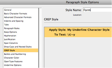
If you want to be super cool- I mean knock-your-boss’s-socks-off cool- use a GREP style as part of the Paragraph Style to automatically apply the Character Style to the Tab and Right Indent Tab characters as soon as you type them.

Never underestimate the power of GREP Styles
It sounds scary and complicated but it really isn’t. Just go to your Paragraph Style>GREP Style panel and edit it so that it looks like the screenshot, below: (the ?\t|~y? is the way you tell InDesign to look for any Tab character or Right Indent Tab character).
Method 2: Tabs and Underline
The next method is identical to the first but, rather than using a Character Style to apply the underline, you just select the Tab characters and apply the underline manually (or by using the keyboard shortcut Command+Shift+U (Mac) or Control+Shift+U (Windows)).
While this method is all fine and good, by not using a Character Style to apply the underline it makes changing the appearance of all the form lines a bit of a hassle should you ever want to do so. And, of course, you can’t use the GREP Style trick unless you use a Character Style. If you’re even halfway comfortable using styles I’d go with Method 1.
Method 3: Tabs with Underscore Tab Leaders
Another method to lay out your form is to use tab stops to set the spacing between the labels but, rather than applying an underline to the Tab characters, you actually edit the tab stops themselves so that that they use the underscore character as a tab leader. You do this by selecting the tab stop in the Tabs panel and then typing an underscore character ( _ ) into the Leader field.
Note: While this works well when using normal Tab characters it does not work so well when using the Right Indent Tab- since the Right Indent Tab character does not have a corresponding tab stop in the Tabs panel so you cannot apply a tab leader directly to it. If a normal Tab character appears on the same line before the Right Indent Tab then the Right Indent Tab will inherit the previous Tab character’s leader setting, but if there is no preceding Tab character you are out of luck. The way to work around this is to type a normal Tab character before you type the Right Indent Tab.
Setting tab leaders is fun and easy!
While this lets you off the hook for using underlines or Character Styles, by using an underscore as the tab leader you lose a lot of the control over the appearance and vertical position of the underline that you would get if you used the underline attribute.
Method Oh Dear God Please Don’t Do This: Inline Lines
One really bad way to create form lines is to draw them using the Line Tool and then pasting them into the text as inline graphics. There are many, many drawbacks to creating a form this way: if the text or column width changes updating the width of all of the lines can be a nightmare, it is very easy to accidentally move a line so it is no longer vertically aligned with the others, etc. Do not do this, only sadness lies down this road.
Making forms using inline lines… just don’t do it
Note: There are some very good reasons to do something like this using inline frames if you do want to create a PDF form and you are using InDesign CS6, but this topic is covered in other posts on this web site, such as this.
So the next time you need to create a simple form in InDesign use one of these methods above (but not that last one) and you should be whipping out attractive and flexible forms in no time.
LOL. Looking forward to that million dollar bonus for using grep styles!
Great write up. I’m embarassed to admit I have used my fair share of inline lines in my time, back before custom underlines were invented. (Because the tab leader trick sometimes leaves tiny spaces between the characters, which is icky.)
For the Child 1, Child 2, Child 3 etc.
You could automate that even further by using a Numbering system and typing that entire line into the Number section (or copy and paste). Then it’s just a matter of pressing Return.
This is a nice variation on the form lines I learned from the InDesigner.
I like the use of GREP styles in this as opposed to nested styles.
I think you get better field recognition in Acrobat when using form lines such as the ones you’ve illustrated.
Thanks!
Your stick people are awesome! Made my day. I remember when I was first learning how to set tab leaders… no one in my office knew about hidden characters, nor how to see the formatting. So all we knew was that setting tabs was very, very hard. My tabs leaders used to get out of control, and I didn’t know how to fix them (other than deleting all my text and starting over). So I would just cover up the extra tab leaders with white boxes… and then later my coworkers would have to work on my files and the text would reflow, and they’d say: “What are are these white boxes for?”
Ashley I have to ask you … what’s the typeface you’re using for the bubble text? And are you using a particular software program to create the stick figures? Or do you have an InDesign library of shapes and line … :D
And also, do you have a comic strip somewhere? You should.
Anne-Marie, the font I use is called “Teenage Angst”. The letter spacing is far from wonderful and I noticed that I should have tweaked the kerning in a number of places in this last article. Oops.
And I just draw the little stick people from scratch in InDesign. Back when I worked on the InDesign team at Adobe some of us old timers called such things “LBOP art”, LBOP (pronounced “elbop”) being a term harkening back even further to PageMaker days to refer to any generic shape that was created using PageMaker’s Line, Box, Oval or Polygon tools, as in “Go ahead and draw an LBOP on the page”.
I have actually thought of doing an entire InDesign Secrets article in comic strip format using my little stick people but I haven’t figured out a topic, yet. Maybe someday…
LBOP art! Savoring that one. thank you!
I’m having an issue where it underlines the title of the line, how did you get it to start after the word? I’m guessing maybe it has to do with the right justify? Using your example, Name, Address, City are all underlined – is there a way to control where the line starts? Via another tab? Many thanks!
Steven, it sounds like you have Underline applied to the entire paragraph.
If Underline is turned on via a Paragraph Style just edit the style to turn it off.
If Underline is turned off via the Paragraph style you may have inadvertently applied it via a manual override or via a Character Style. If a manual override is applied you can remove it by selecting all the text and turning off Underline via the Control Panel or via the Character panel flyout menu or, if you want to be really snazzy, use the Clear Overrides button at the bottom of the Paragraph Styles panel. If a Character Style is what is causing the sad-making underline you can turn this off by setting the Character Style to [None] via the Character Styles panel.
I hope this helps. I think it should… let me know if it doesn’t and we’ll figure out what’s going on.
Thank you Ashley,
You were right about underlining the entire paragraph, for some reason I was imagining that the underline function would somehow automatically bypass the words and only apply to the tab. However, it seems that the only way is to apply the style to each tab and not the text itself. Regardless, got it working now and it is the best way I’ve found to do it – thanks again!