

Leading as a Character Attribute? I’m a Believer!

Ever since I started working with the first beta of InDesign (K2), I’ve been irked by the choice of the engineers to make leading a character attribute. I’d “grown up” with years and years of QuarkXPress and MS Word, where leading is a paragraph attribute. I remember during the InDesign beta, Olav Kvern tried to justify the decision to make leading a character attribute. But his examples were esoteric—or maybe I was just too dense to understand them. I’ve taught hundreds of hours of classes trying to explain to ex-Quarkers why the InDesign engineers chose such an option. But I couldn’t quite convince my students, as I myself wasn’t convinced.
Mike Rankin reminded me that using character-based leading was a key method for increasing leading in a line containing a built-up fraction, something you might use thousands of times over the course of producing a math book.

An example of how a character-based leading could be used to fix the leading for a stacked fraction. The fraction on the left needs more leading to fit properly on the line. The fraction on the right has a slight increase in leading.
But since I’ve never laid out a math book, I really didn’t see how important it would be for me.
Recently though, I created a design that required the first two lines of the introductory paragraph of a story to be a larger point size than the rest of the lines in the paragraph. What I wanted is this appearance:

An example of a paragraph where the first two lines are set in a larger point size and leading than the rest of the text.
To accomplish this, I knew I could use the Nested Line Styles option to change the size of the text in the first two lines. And it would also allow me to edit the text as needed without ever having to manually re-apply the character style.
So I created my paragraph style and then a character style that increased the point size of the text. This was the initial setting for the character style:
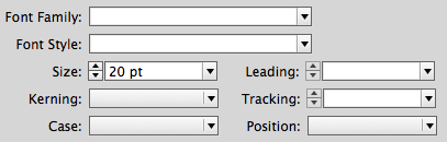
The character style options for increasing only the point size.
However, since I wasn’t using auto leading, this created a collision between the first and second lines of the paragraph. The leading also had to be increased.

A paragraph where the first two lines of text have had a larger point size applied. However, the leading is not correct.
So I changed the character style to also increase the leading:
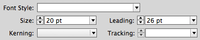
A character style that applies both point size and leading. If leading was a paragraph attribute, this would not be possible to set.
Once this new character style was applied in the Nested Line Styles option of my paragraph style, the first two lines worked perfectly.
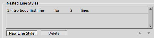
The Nested Line Style set to apply the character style to the first two lines of text.

Now the Nested Line Style automatically maintains the proper leading.
So, almost fifteen years after InDesign was released, I’ve finally become a believer of character-based leading! Olav, you were right!!!
I just wish the ID engineers would add relative leading (I think that’s what it was called in Quark) so that you could enter 12/+2 (12/14) and then if you increased the point size the leading would automatically be 2 points larger than the type size. That was one of my favorite things in Quark and used it a lot.
In the Paragraph Styles – in the Justification setting, there’s an “Auto Leading” setting.
Set this to 140% (or whatever suits) and your Auto Leading will always be 140% more than the point size.
At 12pt type @ 120% it’s 14.4 for the leading. Change it to 140% auto leading and the leading is now 16.8 when set to Auto Leading.
What the Auto Leading is doing in the Justification area I have no idea! It has nothing to do with if the text is justified or not!
Sure that’s one way to do this but if you want to increase your leading by a point, you either have to go to preferences and calculate the right percentage to give you what you want or go back to specifying a whole number for the leading. I come from the pre-computer days when we had to spec type by marking up hard copy with directions for the typesetters and hope you got the calculations right. And when you got your type back, you prayed your type fit in the space you had. Type size and leading that aren’t in whole numbers just drives me crazy. And when I go into someone’s file and see type that’s 12.64/ 13.25, I just wonder “what are you thinking?”Although I guess this could be the result of someone scaling a type box down until it fits instead of working with the type to fit. I just wish all the young folks doing design could experience specing type. I think you would have a much better understanding of how type works in your layout.
Just call me old fashioned but Quark’s relative leading is a link to the old type specing days.
Yeh – I think it’s a strange place to have an auto-leading feature that’s all. Why it’s in with justification makes little sense to me :)
If you want to increase your leading by 1 point go to Preferences>Units and Increments and set it to 1pt.
I am still a non-believer! ;-)
Sandee, I both agree and disagree. I agree that it’s awesome that InDesign offers leading on a character level. But I disagree (mostly with Adobe) that this is the default setting! I always recommend that InDesign users open the Preferences dialog box and turn ON Apply Leading to Entire Paragraphs (in the Type pane). That way InDesign applies leading to the whole paragraph by default.
However, they can always override that, in the few situations they need it. For example, character styles can override this setting. So in your examples, because you’re applying character styles, you can even do it while the Preference is set to Apply Leading to Entire Paragraphs.
BTW, if you’re doing a lot of math typesetting, you should get a plug-in such as movemen MathTools or MathMagic.
Like David, I always have my preferences set to apply leading to entire paragraphs.
I too always have that turned on.
Now a believer too! Thank you for sharing.
Just keep in mind that turning on “Apply leading to entire paragraphs” will only solve the problem (preventing different leading in the same paragraph) in text that’s set to an absolute leading.
Even with the option enabled, if you have any paragraphs set to the default Auto leading, then you can still end up with wonky leading, last line with more leading than rest of paragraph, first lines with raised caps have more leading than rest of paragraph, etc. That’s because the leading is changing due to the user changing type size for some of the text in a paragraph. So the preference option helps but it’s not a cure. ;-\