

Making a Movie Poster

With the Oscars coming up later this month, I thought it would be fun to figure out how to make a movie poster with InDesign. Specifically, how to get the typical look of the credits that appear at the bottom of the poster. The common Hollywood approach is for the person’s name to be preceded by the credit in smaller, stacked type.
There are a few ways to accomplish this, one of which was described way back in issue #3 of InDesign Magazine. I decided to try tables since it seemed like a natural way to get that stacked type to line up with the person’s name.
I started with a table with two rows and six columns.
![]()
Each row would hold one line of the stacked type.
I selected and merged the cells that would hold the people’s names.

![]()
I entered the text for the credits and names.
![]()
Then it was just a matter of choosing the formatting for the type,
making styles to apply that formatting,

fiddling with some of the cell options to get things into alignment,

and then adjusting the width of the cells to fit the text.

To that end, a script (written by Marc Autret and updated by Kasyan Servetsky) saves a little effort. Put your cursor in a cell and run the script to shrink the cell width to fit the contents.
Repeat the process using separate tables for each line of names.

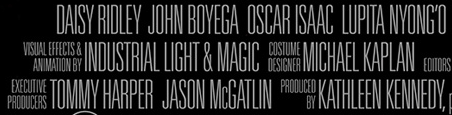
Then center align the tables over your main poster image and you’re done. Click the image below for a closer look.

Now all you have to do is figure out what to wear on the red carpet.
You can also use Illustrator, which, unlike the regular versions of InDesign, can actually deal with Asian languages properly and thus allows for a much easier way to achieve this.
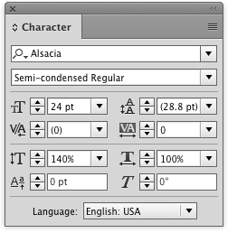
If you use the “Warichu” option from the flyout menu of the Character panel on the words you want to stack, set the alignment in the “Warichu Options” and you’re basically done. You need to enable “Show East Asian Options” in Preferences under “Type” first if you haven’t already. Warichu allows you to keep the text organized neatly in one single continuous line. That way you can also copy and paste text from Illustrator and the word order will still be correct when you paste somewhere else.
I’m not sure if the Japanese InDesign version can do this as well. I can’t understand why they still haven’t figured out how to make one single InDesign that works with all languages in 2017, but that’s Adobe…
Since the billing block is an asset that will be shared among different products, from one-sheets to press material to DVDs, it’s useful to have it as a linked external file anyway.
Nevermind I love you even more.
Sorry but these titles looks terrible…
You’re entitled (haha) to your opinion. Obviously this isn’t intended to be a real poster you’d do for a client, but a fun side project for folks who like using InDesign. Well, at leat that was obvious to me as I was writing it.
Fun, Mike! This article reminded me that Brian Lawler wrote up another technique back in IDM issue 3: https://creativepro.com/issues/issue-3
Interesting. I hadn’t realized that the Illustrator Japanese layout options actually worked in non-Japanese Illustrator.
This is a tip for IllustratorSecrets.com (when you guys get that set up!). Deke McClelland did a video on how to use these Illustrator features to use to make movie posters. Here’s the link:
https://www.deke.com/content/dekes-techniques-056-creating-great-movie-poster-credits-illustrator
The technique actually came from Mordy Golding, former Illustrator product manager.
Just looked at IDM issue #3. I think Mordy/Deke’s method with Warichu in Illustrator is better because once you calculate the settings, you can apply it all with styes, and it seems more precise.
Hello,
There is a font – Steel Tongs – which does all this formatting easily. It was specifically created for this purpose. There is a code sheet which identifies which characters on the keyboard generate the various word groups.
We make movie posters in my Image Management class and it works perfectly.
https://www.fonts2u.com/steeltongs.font
Interesting. Thanks for sharing, Betsy.
As an enthusiastic user of Ctrl+Alt+C, I’d fit the text frame to its contents, then use align and distribute to position the text boxes into their places – without using a table at all.
Horses for course, I guess. :-)
Oh my goodness! How did I miss this? Thank you for putting me in charge of Special Effects!
Haha, but of course!
Good God I love you. Finally a way to do this properly. Thank you!!!
can we use tables to make movie end credits??
You can of course. Tab stops with left/right alignment tabs works equally well. When you’re done you can export a really tall pixel image at the output resolution of the film or a PDF if your other software supports it, and then animate the roll effect in any software that is not Adobe Premiere Pro and render it out for delivery.
Well, I’m a “photoshop + hand-coding” person ( yeah…I know…), but I am very curious about indesign and I’ll sure be coming here and reading a bit about it.