

Making a Text Highlighter

Roger wrote:
In MS Word, you can make text look as if it’s been highlighted with a highlighter marker. It’s a handy feature when you’re trying to emphasize text in, let’s say, an article. Can I do that same type of thing in InDesign?
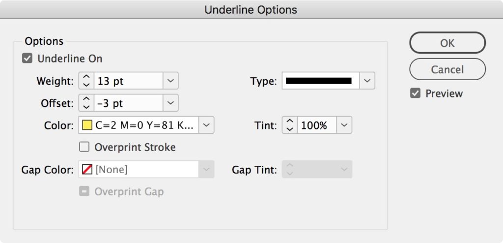
Absolutely! Just press the Highlighter button! (Sorry, just kidding.) The trick to making a highlighter effect in InDesign is the Custom Underline feature, which you can find by choosing Underline Options from the Control panel menu when the panel is in character formatting mode. Or, even faster, you can open this dialog box by Option/Alt-clicking on the Underline icon in the Control panel. Don’t forget to also check the Underline On box to activate the underline.
Unfortunately, when you select some text to apply this effect, it’s often difficult to accurately view the effect you’re trying to achieve (even with the Preview option selected). So, when creating an effect like this, it’s often a good idea to choose Window > Arrange > New Window for [filename] — this way you can work on the highlighted text but also see the effect in another window on your screen.
Anyway, once you have some text selected and the Custom Underline dialog box open, you can give the text a thick, yellow (or any color) underline. Then adjust the Offset to set the highlight in the position you want vertically. Try using black as your highlight color to create a redacted look or set the line type to dots and fill the gap with the same color to create rounded ends.
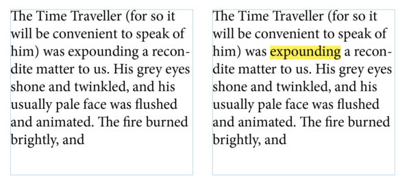
Here’s a sample of this highlighting effect (before and after):
Now here’s the important part: After you make one of these, save it as a character style! (Just Option/Alt-click on the New Character Style button in the Character Styles panel, then give it a name and click OK.) As long as the character style attributes are set to only apply this custom underline effect, you’ll never have to go through the trouble of making one again — just copy that character style from this document to wherever else you need it.
We are refreshing our oldest and most popular posts with updated information and screenshots. This post on making a text highlighter was originally published January 3, 2007. For the most current comments scroll to the bottom of the page.
Nice trick but I would suggest using the strike through options for that effect instead. That way you can still highlight and underline at the same time.
Rene, the reason I like Underline rather than Strikethrough is that the strikethrough ends up on top of the text, so you can’t see the text! You can turn on overprint, but then you need Overprint on to see it, and there are other potential issues to contend with.
Hi David, so how can I then underline and highlight the text at the same time? can you please help
thank you
WOW! I had no idea that I’d get an answer so quick and be the subject of a blog. Thanks so much. InDesignsecrets.com is now my #1 desktop publishing bookmark.
Thanks David. I spent the morning having words with Mr. Gates so the “click the highlighter button” response brought belly laughs. I have used somewhat transparent yellow, green, blue and pink as fills in tables that needed highlighter effects and hadn’t even thought about this approach.
“As long as the character style is set to only apply this custom underline effect, you?ll never have to go through the trouble of making one again…”
Well, almost never. The highlight has a fixed size and offset, so type set at different sizes/leadings will need different underline styles for their highlights. When I create such character styles I usually name them something like “Highlight YLO 11pt” with the size refering to the type point size. Then I save them to a global template from which I load various styles into specific projects.
Ah, yes, Pariah. Excellent point. If only we could type a percentage of type size in those fields!
I would like to suggest another alternate is Paragraph Rules (cmd+opt J) if you want the ultimate in control. The trouble with underline is that tends to clip very tightly to the end letterforms, with rules you can add an offset, which is needed for right aligned text – say in a page header. The pain with rules is that you need to play with the above and below parameters to make it apply to an entire paragraph block, slightly flakey.
marc,
I feel like you are talking about the exact issue I am trying to find an answer to right now.
I too am trying to make headings…in a 3 column set-up.
Can you elaborate a little more on “how-to” with your Paragraph Rules suggestion??
Josh A: I think he’s referring to this trick, which you can apply to a whole paragraph, such as a heading: https://creativepro.com/setting-reversed-out-headline-text-white-on-a-black-bar.php
Never mind…self explanatory ha ha!
Got it!
Great suggestion! This is exactly what I needed.
Cheers to you, and David Blatner for this awesome website (and all the amazing work he does).
I would probably use the Rule Above/Rule Below method if I were trying to highlight a one-line heading (such as reversed out text). However, if you are simply selecting one or more words in a paragraph, the paragraph rules feature is pretty clunky. If you want extra space before or after the text highlight, just add some sort of white space when you’re applying the custom underscore.
Just to be bold and different…
You can create an anchored object, and use that as a highlight. Sure, it’s more work than just using a character style — but you can brag to your friends that you use anchored objects :)
Mordy, if you’re looking for a more complex method to achieve the same effect, you can also draw with a highlighter pen on a piece of acetate, photograph it against a bluescreen with a high-end digital camera, use a plug-in to set the blue to transparency, import the graphic, place it over the text, and use the Transparency palette to set it to Multiply. That is to say, there is always a more difficult way to do something! I’d rather get the job done than brag to friends. ;)
Trust me David, I don’t go looking for more complex methods… they find me :)
A derivative trick is to include preceding and trailing white space or punctuation in the selection, set the Underline > Type to Dotted or Japanese Dots, and then apply the same swatch to the Color and Gap Color. This gives you a nicely rounded highlight as opposed to the blocky version.
Great idea, Caleb! This was shown in the most recent issue of InDesign Magazine (indesignmag.com) but with paragraph rules. I like the idea of doing this with the custom highlighting.
there is a problem shown to me i can’t fix it the text When you type any word I
find the text shaded in yellow and space between text White
How do I cancel this option
thanks guys i found the solution
cmd+k–> composition –> unmark Substituted Glyphs
A solution to Mark’s problem where the ‘underline ? tends to clip very tightly to the end letterforms’ is to add a thin space (shift+opt+cmd+m) to either end of the text and include that space when creating the rule.
However, what I want to know is this: will the black text (if the text is black) overprint onto the yellow/whatever colour rule when separated? Or will it be knocked out?
Yes, by default, anything set to the [Black] color will overprint. But if you make your own color swatch that is 100%K, it will knock out — unless you specify overprint in the Attributes palette.
Here’s a good way to check: Open Window > Output > Separations Preview, set the palette to On, and turn off colors one at a time to see what’s overprinting and what’s knocking out.
Caleb, very very clever! I love it.
I hope you can help, I can’t find a fix.
My client wants certain paragraphs highlighted, and when I use the custom underline thingy, I get a ragged right margin even though the text is justified. Please tell me there is a trick for this.
If not, I may have to resort to anchor boxes which will be such a pain because the text may often break between columns and the client is CONSTANTLY making edits so text is constantly shifting.
Any ideas? Thanks.
OK… one thing I just noticed. I had a 1p left and 1p indent. If I remove the indent, it works fine.
Anything I’m missing that would work with the indented (block) text using the highlight trick?
I’m baaaaaccccckkkkk… This morning I pulled up the file and was pleasantly surprised to see that the highlighted text was perfectly aligned on the right.
But before I could celebrate, I extended the text box and poof! the ragged edges were back. So I experimented. If there are 6 lines in the paragraph, it’s nicely aligned, if I pull up the text box, to 5, 4, 3, 2 lines or pull down to 7, 8, 9 it’s ragged.
Any ideas? (The font is Helvetica Neue, Open Type.)
Hi Cathleen… wacky! You’re right. This appears to happen only when there is a right indent:
The space characters at the end of each line are being highlighted, where as when there is no indent, the space characters “disappear.”
I can’t think of any good solution other than to replace the space at the end of every line of the paragraph with a Shift-Return. (Blech!) Or, better yet, find a way to not use the 1p right indent.
I use this feature for underlining text that has changed in our document and if any of the text already has a character style (e.g. bold) applied, it gets overrided and changes to the paragraph style. Grr. I like to use the character style so I can eliminate it quickly in subsequent versions. Am I missing anything?
is it possible to change the opacity of the underline (so that if the text block is over an image you can still see some of the image through it?)
@ Joe
No. Opacity is an attribut of whole Frames, whole Boarders, whole Text ? but not of specific Text attributes or Characters.
I am no techy, and have not learned to highlight, yet. But this ragged edge bit, seems to me, could be over come by adding yellow type to the ends of the right side, as necessary, to cause the yellow desired highlighting to match the effect you desire. This sounds reasonable to me. Let me know if it works.
Hey. Thanks for posting this. After much work on trying to figure out this simple task, I turned to Google and found this tutorial. Thank you so much for your time in putting this online. It’s been a huge help to me and my magazine.
Thanks
Bo Lane
Hey Joe (and Jochen) – where you going with that solid highlighter effect in your hand?? Sorry… just been reading the posts, super helpful. here’s an obvious tip for making your highlighter ‘lines’ semi-opaque. Set up your highlight using the underline as described, select and copy the text, then make the text the same colour as the highlight/underline. Now you can select the frame and make it whatever opacity you desire. Once thats done just paste in place the text you copied and remove the underline from that. Voila – text with semi-opaque highlight!
Leigh in Leeds, UK
Thanks a lot man!
Thanks for the tip Dave I think your blog is fantastic I am a magazine layout designer just starting out and these blogs help a lot so cheers!
David,
Thanks. Works great, except for available color selection.
You wrote, “…you can give the text a thick, yellow (or any color) underline.”
I’m using ID CS4. Using your technique, I am presented with eight pre-determined colors in the Underline Options panel/window.
How can I select other colors for this underline trick?
Thanks.
@Francis: You must first define more colors in the Swatches panel.
David,
Many thanks. You taught me two things–one that answered my question and one that taught me that I could “invent” my own colors in the swatches panel.
(In case you can’t tell, I’m just past being a raw beginner in things Adobe.)
Thanks again.
hi leigh, I need a designer in the states – happy fishing !
[…] Of course, there are plenty of other ways to make a similar “reversed out text” effect. For example, you could place the heading in a single-celled table! That’s useful when your heading is more than one line long. (The Rule Above/Below trick can be done with multi-line paragraphs, but it’s kind of a hassle.) You can also use a custom Underline. (Here’s another link to a custom underline solution.) […]
Wow! This is a cool trick, helped me achieve so easily. Thank You!!!
Old thread and all that.
Here is another method, a bit over the top if you ask as it uses conditional text.
https://www.kerntiff.co.uk/free-stuff/highlightpen
Best.
….so I had no problem figuring out weight, but offset wouldn’t work no matter what value I gave it. The bottom was always unacceptably lower than the bottom of the letter. I ended up making colored boxes to put behind the text box, which has no fill.
This is great. Thanks! BUT, I have one small problem. I use Character Styles throughout and it is impossible to apply a Character Style to text that already has another Character Style applied. Any solutions besides creating duplicates of all my character styles; one with a highlight and one without?
I have a similar issue as Aimee does with character styles over riding the paragraph style
How would I go about correcting that?
Hi this is a great, the only thing i have a problem with is i would prefer the text had an indent on each side i.e not right butt up against the first letter the only way i have found how to do this is to have a paragraph style with a indent of -1 on left and right therefore it follows whatever you write, only thing is you have to press return after every line you type or else it only applies it to the last line of the paragraph is there any way this can be done so that when i type and go to a next line the highlighted area follows but on each new line it has an indent into the colour of the 1mm
Thanks
Hey David!
I was wondering if you had a tutorial showing how to have the highlighted text move along with the narrator is reading in the audio. Or is that even possible?
Thanks!
TJ
ANYONE have an answer???
TJ, there is no way to do that in InDesign itself, as far as I know.
Ah. Ok, thanks David.
I was just watching one of InDesign’s tutorials and they said it could be done but they didn’t say how, nor do they have a tut on it! :(
Here’s the tutorial: https://helpx.adobe.com/indesign/how-to/ebook-fixed-layout.html?set=indesign–key-techniques–epub-fixed-layout
Thanks again for getting back with me.
TJ
TJ: I’m sorry, perhaps I should have been more clear… this is possible in some ereaders, but it is not possible to do from within InDesign. Liz Castro wrote about it here, for example.
Ah! Ok! Thanks David!
has anyone found how to give a text highlighter a stroke, such as a white highlight with a black stoke to offset a pink and blue lettering stroke and fill
Thanks for great tip.
I have been able to achieve a really nice highlight and underline effect by using underline for the highlight (offset) and then strikethrough for the underline (offset). I created a Character Style with a 10 point underline in yellow, offset -3pt, and that put it very nicely behind the 10 pt text. Then I added Strikethrough, offset -2pt, weight .75 point, for the underline and colored it (in this case) dark blue (to match other parts of my text where I am editing a large document using styles to differentiate different changes). I defined this as a Character Style so I could selectively add it to just certain phrases or sections of text.
Hi
With a character style and underline technique is it possible to reverse out the text for the entire line EG: A Sub heading
Or is it best practice to use the rules above/ below methods in a Paragraph Style for entire lines?
Hey Guys,
I was getting pretty narked at not being able to insert a space before & after the highlight using a character style, so I had a think:
If you set up your Character style with the coloured underline, and then go through and apply this to your text, you can add the space easily afterwards. In Find/Change, use a GREP:
Find what
.+
Change to
/s$0/s
Find format:
Use your character style here
Change format:
Use your character style here
Job done… Hope this helps someone else out there!
This is just so beautiful. Thank you!!!
I just created this character style. Just what I needed. Have I mentioned how much I love InDesign Secrets?
Hi David,
Thanks for the update.
But COME ON EVERYONE! Why in the world can’t InDesign implement highlighting just like Word? Select some text, click, choose your highlighter color and DONE!
Why do we have to jump through so many hoops? I mean a blog post with 58 comments to explain? I hate it when Word does stuff better than InDesign. Sorry everyone, thanks for listening to my rant ;-)
I read your latest comment simply because I was curious to see if you use the same method I do. (You do.) But I love your idea of using dots for a rounded edge. It just reminded me how much I enjoy your posts!
Is there any way for me to see your whole InDesign training course without subscribing to thousands of other courses on Lynda? As I mentioned some time ago, I can’t commit to viewing it all in a short time, but I’d sure love to be able to when I find the time.
I am using ID CC 2017 on Windows 7. When I try to set a new character style using the underline trick for highlighting, InDesign crashes. Tried it several times. Any ideas?
I assume this would also work in InCopy.
I also assume bt can’t
thank you so much for this
David, do you know if there’s a way of tuning the way we highlight more precisely? For example, I have some code in my text and I want it to be highlighted. I want a left and right padding to be present and also the corners of the highlighting rounded. Is there a way to do it?
David, you are the best. I used your Lynda tutorials to learn InDesign and every question I google, you’re there! INDESIGN KING.
What if you want to highlight underlined text?
Figured it out. Strikethrough weight/offset with underline weight/offset if anyone is curious. Just hope you don’t need to highlight underline and strikethrough all at once
Nice tip. Is there any way to do this trick but shouldn’t export or print the shading? (in paragraph shading there is such an option not to print or export the shade)
I am trying and trying to use this effect. I have about a million instances of “SOLD OUT” that I need to highlight. Only I need the highlighting to extend before and after the word. I can insert a thin space before the words but not after. InDesign just kicks out the last thin space because it’s at the end of a line of text. Any other solution?
Any suggestions for using this on bulleted text, but not the WHOLE bulleted item? I use this technique often but just tried on the first two lines only of a 4 line paragraph that has a bullet. It will only highlight the first line (the line that has the hard paragraph return and bullet.)
After creating a highlight character style, I would apply it with a Line Style inside the paragraph style for the bullet paragraphs, like this:
