Making Sure Blackout Redactions Work So You Cannot See Through Them
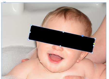
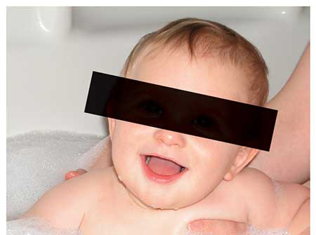
Have you ever placed a black box over something, trying to blot out whatever was behind it, only to find that you can see through it after all? For example:

How the black frame appears in InDesign

How the black frame appears in Acrobat (and probably in print)
And what’s even stranger, the settings you choose when you make the PDF sometimes affects how it appears in Acrobat. For example, if you export the PDF with a PDF/X standard you can see through it, but if you turn that off, it doesn’t show up in Acrobat… but it still may print incorrectly!
The fundamental problem is that black ink is not really black — it’s charcoal gray. And printing black on top of other colors doesn’t necessarily “knock out” those colors. Put dark gray on top of a bunch of color, and you can see the colors through it.
The reason the PDF/X settings affects how it appears in Acrobat is that when you choose one of the PDF/X settings, it signals Acrobat to turn on “overprint preview” so you can see what it will really look like. You can turn that on manually in Acrobat if you want.
There’s also an Overprint Preview setting in InDesign which will work, too, except for one problem: Inside the Appearance of Black pane of InDesign’s Preferences dialog box, there is a setting called On Screen, and by default it is set to Display All Blacks as Rich Black. That means “don’t show me accurate print-like black.” If you change it to Display All Blacks Accurately, and also turn on View > Overprint Preview, then you’ll see the “real” black — the more-accurate charcoal black that doesn’t really knock out color

I wrote about this, along with some solutions in this old article, but that was five years ago, and we keep getting questions about this, so I figured it was time to mention it again.


Good tip but what I’ve found is that the ‘redaction’ is fine for reader but it can be pulled apart with acrobat to reveal the original image.
To achieve a true ‘redaction’ use it with the transparency flattener trick. You’ve written about it here: https://creativepro.com/converting-text-to-outlines-the-right-way.php
Here is an example of what it looks like pulled apart in Acrobat (top image is without transp. flat, bottom image is with): https://i58.tinypic.com/syknxt.png
Dan, you are SO right about this. I used the word “redaction” very loosely and I should have been more clear about that. I was mostly focused on really knocking it out for print.
Yes, if you flatten the PDF you can really knock it out in the PDF, too.
I wrote a article in Dutch on my blog about that preference. On that Dutch blog I have two videos that show what this setting does on screen in InDesign and in RGB PDF export.
Yes, the comment in that videos are also in Dutch ;-)
https://fvdgeest-dtp.blogspot.nl/2014/06/wat-doet-de-voorkeur-vormgeving-van.html
I’d rather use Acrobat’s Redaction tools. It suck that stuff right off the page.
I’m with Sandee. It’s faster, easier, and more bullet-proof to do actual redaction in Acrobat. In later versions of Acrobat you’ll find the Redaction tools in the Protection panel.