

Making Heat Maps with GREP and Data Merge

Back in 2014, a technique was demonstrated that would apply a cell style based on a Find/Change setting. The technique was improved upon further by using a script that can be found via this forum, ultimately creating a heat map style table.
However, what if the data changes, or if hundreds of these heat maps have to be made for a book or a variable data print campaign? What if the heat map isn’t always in a table, but in a graphic? That’s where GREP styles can assist with this task.
The concept
For example, take the number 24. If this number represents a 24% tint of its original fill color, a character style that contains the original fill color plus its 24% tint value can be created. A GREP style can then be assigned to the paragraph style to indicate that whenever the number 24 appears, to apply the 24 character style.
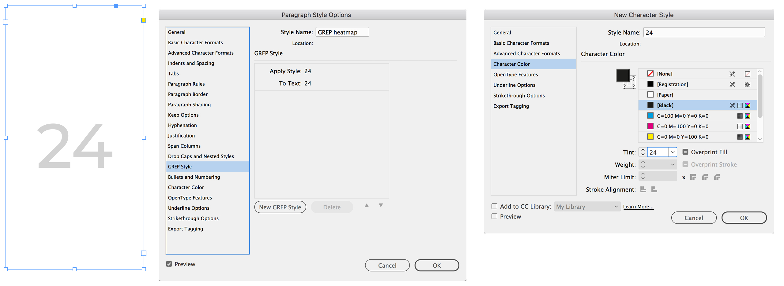
But for a heat map, the background needs to be colored. Using the same technique, the character style can be changed to apply an underline large enough to fill its future placeholder, and the appropriate tint of the color.
Now, whenever the number 24 is typed, the GREP style activates and transforms the text frame into a colored rectangle.
Here is where most people would stop
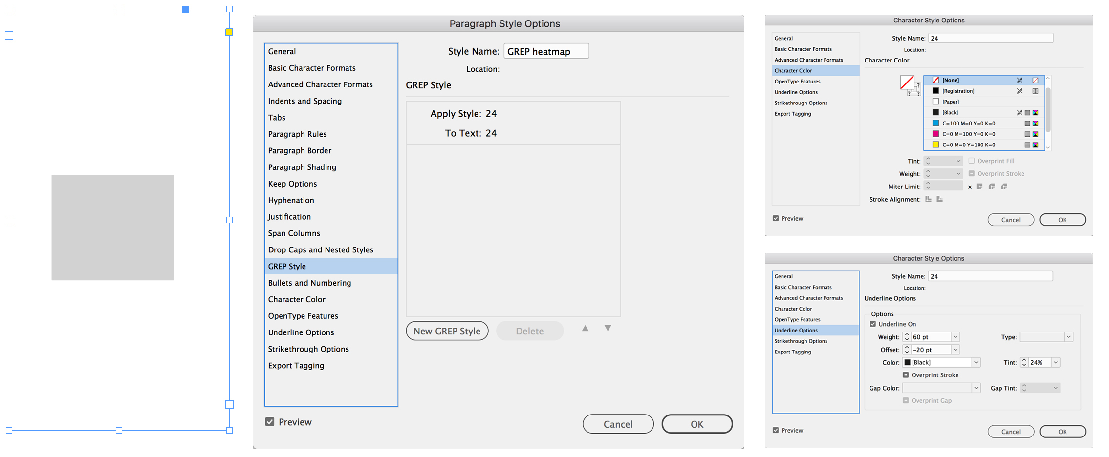
But 24 is only one value—a heat map can be used to represent statistics from 1-100, does this mean 99 more GREP styles need to be made? For this technique to work, the answer is yes. It also turns out that 100 is the maximum amount of GREP styles that can appear in a paragraph style.
This is the point where most people would say “too hard” and do the task manually. But if there was a script that would make the 100 GREP styles required for this technique, that would be easier. Well, here it is!
As usual, download and install the script (instructions here). Once the script is installed, run the script while the appropriate InDesign file is open.

If the script is run while a text frame is selected, an additional alert is presented:

And voila, the styles and heat map swatch are all produced.
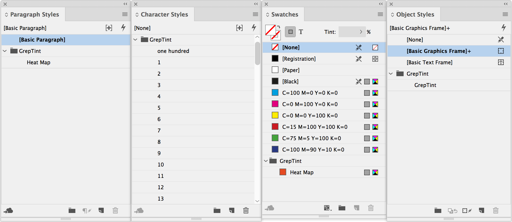
Another look at the GREP styles of the paragraph style that creates this technique also reveals that the circumflex (^) has been added to the GREP styles. This ensures that only numbers at the start of a line will have the style applied to them.

OK, so whenever a whole number between 1-100 is typed, the background changes color to reflect the tint strength of the whole number. But how can this be implemented to make heat maps? The answer is by cutting the text frame that contains the heat map and pasting it into a desired shape that needs to reflect the heatmap value, and this is done using the Paste Into feature from the edit menu (Option+Command+V on a Mac, Control+Alt+V on Windows).
The Heat Map paragraph style may require the font size and underline options to be adjusted to suit each heat map, but here are two applications of the technique:
Applied to graphics
In this example, a heat map is used to represent unemployment statistics in the European Union.
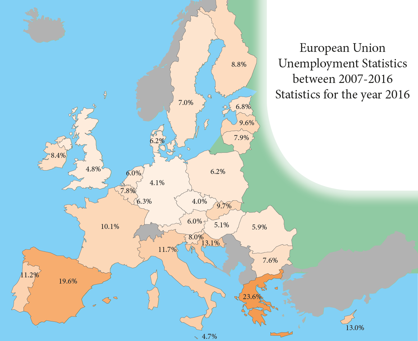
Each country is its own shape drawn in InDesign, and a database that contains the statistics has been added via Data Merge. The script that generates the heat map styles has also been run. As mentioned above, you may need to adjust the styles to suit each heat map.
In this example, the paragraph rule had to be at least the height of the largest graphic, which in this instance is Sweden. Both the size of the font and the underline were then increased accordingly in the Heat Map paragraph style. With the technique in place, it is possible to toggle through the Data Merge preview to see that the color of the countries changes based on the values in the database.

Applying the heat map styles to table cells
The same technique should work, right? Well, not without some modification.
Applying the Heat Map style directly to text in a cell won’t change the whole cell, only text within the cell, so the initial technique that worked with graphic frames needs to be applied here. The difficulty is that you cannot paste a text frame into a graphic table cell via Paste in Place.
One workaround would be to draw graphic frames where the table cells are, paste the Heat Map text frames in place, and send the graphic frames to back or put them on a lower layer. This technique was used to create the heat map of 60 years of maximum record temperatures in my home town of Adelaide:

But it is possible to turn a graphic table cell into a cell capable of receiving content via Paste in Place, but it requires that all cell margins in the appropriate cell to be zero. From a regular table cell, convert it to a graphic cell. Select the newly created graphic cell and cut it – this should now be a regular table cell. Click on the table cell with the text cursor and paste, and the cell now becomes what appears to be a graphic cell that will allow the Heat map style to be pasted into place.
While researching this technique, GREP expert Jean-Claude Tremblay provided this solution that would allow the Heat Map style and the value to appear at the same time in a table cell. That is:
- In an empty table, set the Cells Options to Clip Content to Cell
- Create two text frames – (a) one with the Heat Map style and another (b) displaying the actual value to be represented. Align and group both text frames.
- Copy and paste it into the Graphic Frames created as described above.
I hope that readers find this tip useful and – in addition to the GREP Graphs script that I wrote about earlier, make fluctuating statistics a little easier to prepare, and also open the possibilities for some imaginative Data Merge variable data campaigns.
More Resources To Master Design + Data
CreativePro Week is the essential HOW-TO conference for creative professionals who design, create, or edit in Adobe InDesign, Photoshop, Illustrator, Acrobat, and Microsoft PowerPoint.
Featuring over 30 expert speakers and 75 sessions and tutorials, CreativePro Week offers five days of in-depth training and inspiration, all in one place. No matter your skill level, you’ll learn techniques and best practices you can start using immediately to improve your productivity.
Members get a special discount on registration! Sign up today.
Thanks Colin !!
Waiting for your paid pro version of the excellent script to export from datamerge.
What font is required for this to work. When I run it I get an error that the font family is not available.
Courier New
Hi Colin, why lock the script code here?
Hi Colin, why not share the script code here?
Maybe for the same reason you lock yours! ;)
Hi JC!
Surely! ;-)
… So I would appreciate that lots don’t blame me when I do it!
… I’m totally with Colin about the scripting protection, even if as here 5 lines of code could be enough! [out of alerts].
Dear Colin,
thanks for excelent set of articles about Indesign vs datamerge. Do you think is it possible use negative number in the bar graphs? Maybe hack somehow?
So I’ve been trying to follow these directions as best as I can, but they’re kind of confusing. When I group the two text frames and input text, only the text changes. The frame with the heatmap style doesn’t change. Is there some kind of video out there that isn’t on this site that can help me understand what you’re doing so I can make this work?
Never mind. I figured it out. Thanks so much!
Hello, I keep getting the following error when using this script:
Error number: 90951
Error string: This colour group name is already in use. Please choose another