

Perfect Strokes on Outlined Text in InDesign

If you’ve ever had to convert stroked text to outlines in InDesign, you know the meaning of disappointment. What was a perfectly aligned stroke sitting behind the live text becomes…a mess.

By default, the stroke is aligned to the center. So you might try changing it to align to the inside or outside. But you will probably find no joy with either.

Though you might get lucky, if none of the letters overlap or have any enclosed spaces (aka “counters”). In that case, you can simply change the alignment of the stroke to the outside and go about your day.
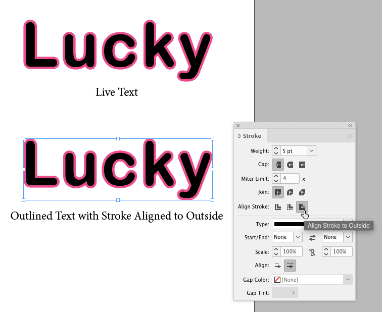
But if you’re dealing with a script font, or the text contains letters like a, b, d, e, g, o, p, or q, you’re out of luck.
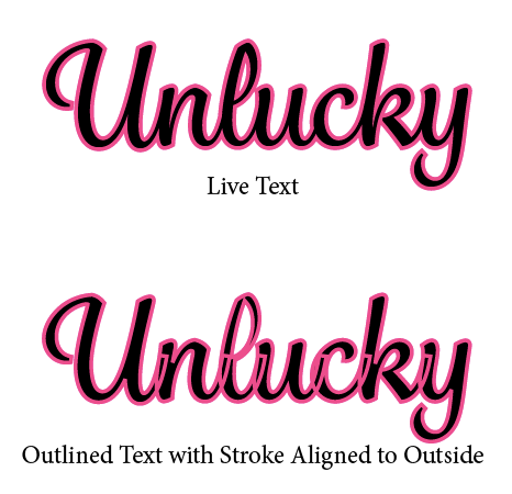
The fix that I like to use here is to make a stack of three copies of the outlined text. The bottom copy has the stroke aligned to the outside, the middle copy has the stroke aligned to the inside, and the top copy has no stroke.

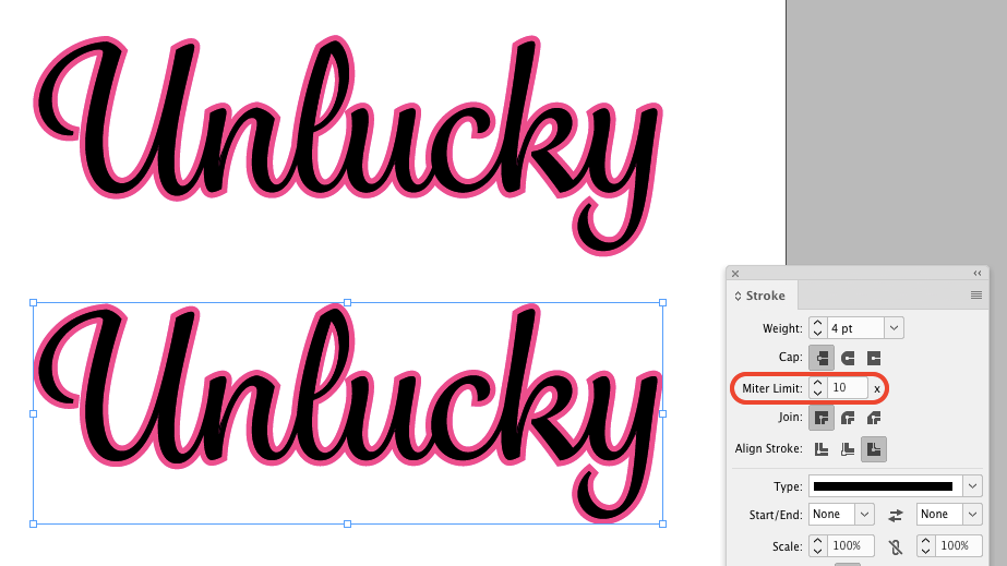
So the bottom copy adds the stroke around the outside of the letters, the middle copy makes strokes visible in the counters, and the top copy obscures any defects. Well, almost any. You may also have to play with the stroke width and miter limit values to get the effect right.
Just remember to group the three copies of the outlined text so they don’t come out of alignment.
Wouldn’t it be possible to align the stroke to the center and then go with only 2 copies of the outlined text (the top copy having just a fill)?
Yes, that will work in some cases. You just need to double the stroke width. The sandwich method is slightly more tedious but it works in every case I’ve come across.
I use drop shadow and change distance to zero, etc to match an outline. I think it’s easier than the example of three copies
That’s an interesting alternative. But to get the same effect as a stroke you’d also need to set the color, blending mode, opacity, and spread to 100%. And then the resolution of the shadow/stroke would depend on the output settings you used. Even so, I like the idea.
Maybe I have missed something, but why not convert the text to outlines without any stroke and then add the stroke to the resulting object, centre, inside or outside as you wish. I agree with the comment about adjusting the mitre limit and i find it helps to “round” the corners of the stroke as well.
It doesn’t matter if you apply the stroke before or after converting to outlines. You’ll get the same result, which will be unsatisfactory in most cases.
If you’ going with the three copies, the pain begins as soon as the text needs changing. It’s not a big deal when you’ got only one of these situations in your document. But if they appear frequently, it might be worth the time to apply a paragraph style to the text on the top and define a variable for it which you can then place in the two text frames below, then apply the strokes to those variables, preferably using character styles.
What about using pathfinder to join the shapes?
After they are outlined…
I was thinking the same thing, so I tried it, but this does not work in InDesign as it does in Illustrator: InDesign creates some kind of compound path of all letters and places them as an anchored object inside a text frame. You have to cut the word(s) from the text frame, delete the frame and paste the text back before you can edit the shapes. And even then you have problems, because you have to release the compound path (and solve the new problem with the inner shapes like eyes and counters) to seperate the letters, to be able to join the shapes with pathfinder. And if you were willing to do all that, you will notice that the paths inside the letters are reversed and the stroke will not be aligned :’-(
So, Mike’s solution or doing this in Illustrator are still the best options as far as I know. Please correct me if I’m wrong!
I may have missed something, but using the appearance panel to add fill and strokes or multiple strokes makes it easy and you don’t get any of these problems. One layer of text that is fully editable and doesn’t change when outlined.
I can’t find an appearence panel in InDesign (this article is about InDesign, although that’s not very obvious).
I’ll not use any of these. I have two different approaches:
a) Apply an outline to the text in InDesign. Copy it and paste it to Illustrator. Again copy the frame from Illustrator and paste it to InDesign. This will keep the design intact.
Save the Illustrator file, this might comes in handy if you need to alter the text.
b) Try “https://creativepro.com/converting-text-to-outlines-the-right-way.php”
This is the technique I frequently use, sometimes with as many as 6 layers for inlines, shadows, etc. I am going to try some other techniques your comment contributors submitted. I agree with Tom that round corners would make the terminals look nicer on a “soft” script such as this.
I would do this in Illustrator. (1) Create outlines, (2) Offset path.
InDesign does this perfectly every time – add a stroke, and it’s beautiful. No miter spikes.
It’s so strange that so many things are simple to do in InDesign (option click to select the next object below, for example), and are made so difficult to do in AI…. when they’re both Adobe products. I have to use AI sometimes when working on files for certain printers, and it’s incredibly frustrating.
AI is just a very inferior program in my opinion.