

Poll Results: Which Interface Color Theme Do You Use?

Hey folks, it’s time once again to review the results of a poll and launch a new one.
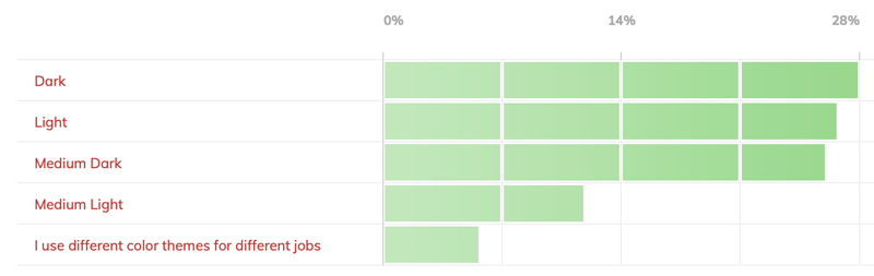
This past month, we asked which interface color theme you use.
I used to dislike the darker choices, but now I go back and forth between Light and Medium Dark. This would put me in with just under 6% of respondents, who switch between color themes.
The vast majority of respondents were almost evenly split between Dark, Light, and Medium Dark (each getting between 26–28% of the vote). Medium Light was a distant 4th, coming in at 12%
Here’s a graphic showing the results:
New poll:When was the last time you use the Export to SWF (Flash) format?
Our new poll asks when you last exported an InDesign document to Flash format (SWF). Is it an antiquated technology on its way to extinction? Or do you still use it? Would you miss it if it disappeared? Let us know!
I hope the light interface never goes away. I am not able to look at white text on a dark background, as it gives me ocular migraines. I can’t even read the info pages in iTunes since they switched to a dark interface.
I’m with Erica, on the light interface opinion. (Though, thank goodness I don’t get ocular migraines from dark work interfaces–I get those from a surfeit, in its most excessive sense, of chocolate.)
It may be because older eyes need more light to see well; but though dark backgrounds sometimes look very attractive in finished pieces, for me dark work surfaces have never been comfortable to work on, especially when text and smaller objects on a dark work surface are involved.
So, I am relieved there is a choice!
Technically, mine aren’t ocular migraines…but rather “migraine events without headache with aura.” Quite the mouthful…I’ve also heard “Silent migraine.” Basically I get the aura part, with flashing geometric fractal shapes that make it impossible to work on a computer for an hour or two (though I HAVE powered through before, but I feel like I’m floating in space). My triggers are bright lights or the starkness of white letters on a dark background. It becomes a jumble, which triggers the migraine aura. Even flashing GIFs and animated ads can trigger it.
I just hope these types of issues are taken into account when the interface designers add “features” to the software.
Same thing here with the geometric bargello design aura, Erica. Flashing gifs and certain other animated features and banner ads are to be avoided (yeah, it’s not just too much chocolate) and then all light objects, type, headlights, whatever, become big blinding blurs of bright.
If interface designers haven’t experienced these kinds of issues, I don’t know how they’d include them for consideration, though.
I am unable to read the numbers in the graphic.
The red text shows up, but the numbers in the light green bars do not.
Any Suggestions?
The only numbers in the graphic are the percentages (0, 14, and 28) across the top, in grey. There are no figures in the green bars themselves. Hope that helps.