

Poster Frame and Mat Effects

If your layout contains photos, paintings, or posters you can easily add effects to make those images look like they’re framed and matted. There are several ways to do so, but none simpler than giving the image a thick stroke to represent the frame.

image from freevintageposters.com
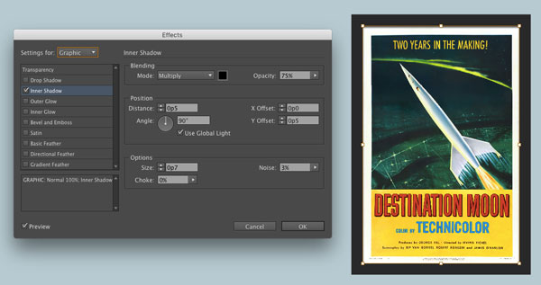
Then add an inner shadow to the graphic so it looks like the frame is casting a shadow on the image. To do this, make sure you have the image, not the frame selected, and go to the Effects panel. It should say Graphic (not Object). Then click the FX button at the bottom of the panel and choose Inner Shadow.
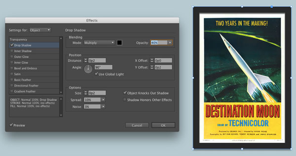
Select the frame and apply a drop shadow with similar settings.
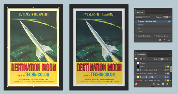
Finally, toning down any areas of pure white and black can make the image seem a little more real and less digital. Lower the opacity to reduce the blacks. To make white less than white, again select the graphic and set it to Multiply in the Effects panel. Then add a fill color to the frame to blend with the image.
You can go for an old yellowed look, or add a light gray fill to give the effect of paper instead of pixels.
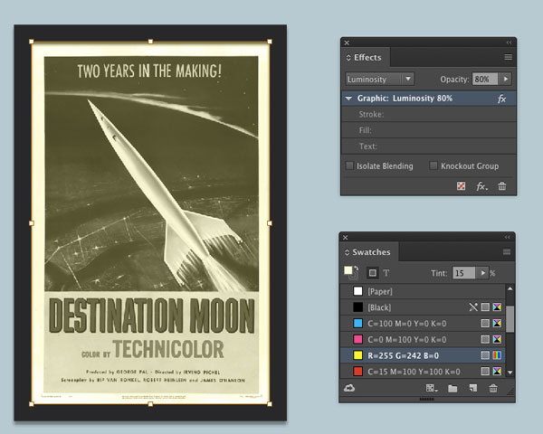
For a monochrome effect, try the Luminosity blend mode applied to the graphic and fill color in the frame.
Thanks for the answer to the latest contest :)
You never know what you’ll find around here ;)
And this answers my question about why InDesign gives us the option to apply the drop shadow to the image as well as the frame–and reduces my grumpiness about them adding functionality that is only irritating, not useful. Thanks, Mike!
Great article. I’ve used some of these effects in Photoshop, but now can expand them into InDesign. I like the part about using some blend modes for different effects. Thanks…very helpful and useful!