Put Bullets Before and After a Heading in InDesign
Maha wrote: In the paragraph style, how to create bullets before and after the text.
Well, InDesign’s automatic bullets feature (which you would use for a list) only places bullet characters at the beginning of a paragraph. You can kind of fake it, putting the bullet at the end, which Bart Van de Wiele described in Issue 56 of InDesign Magazine, and which I modified for numbering in this article.
But that technique won’t let you put a bullet on both sides of a heading.
There is one way to do it, though… it’s kind of a hack, but it works, as long as the heading is only a single line.
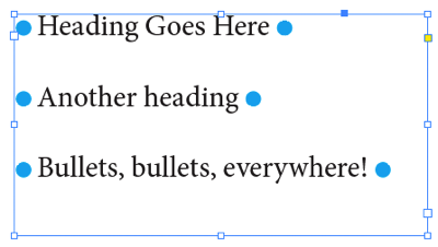
Here’s the result:

And here’s how it’s done: Use a Rule Above and a Rule Below.
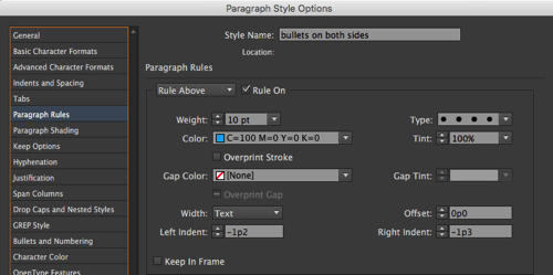
The Rule Above is a dotted, very thick rule that extends past the end of the text:

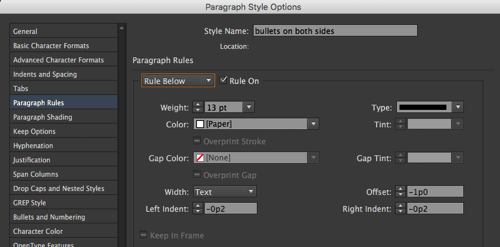
The Rule Below is a solid, even thicker white (Paper) stroke that covers up the blue dots:

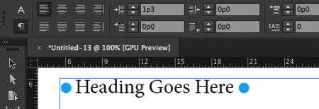
Oh, and to keep the whole thing inside the text frame, I also increased the Left Indent a bit.

So, however long the line of text, the strokes extend a little farther on the left and right. The “dot” size and color is based on the Rule Above.
It takes a little experimentation to get right, but once you have it, it’s a paragraph style, so it’s easy to apply over and over again.


I tried and it works fine.. and found that i have to change rule below color as per my background color. is there any shortcut for this that i don’t have to change it manually.
[i think ! swatch option can do this.]
thanks @David
Unfortunately, no, I think you need to manually change it from Paper to the background color.
You may define your own stroke style (dotted) with a very big pattern length. That way you don’t even need the rule below.
Martin Heise: BRILLIANT!
Here is how it would look:

Very clever David. I love “hacks” like this!
Could you do it as a nested style, with a specific space (say, en space) and bullet character manually typed at the end of each heading, then the nested style would take effect after the en space?
Yes, but the point of the article is to apply the formatting with a style, so you don’t have to type a bullet after (or before) every heading. That could take a lot of time.
Great time saver!!
If you want more!
13/08/2016 – https://forums.adobe.com/thread/2194887 [post#4]
24/08/2016 – https://forums.adobe.com/thread/2199473 [post#8]
24/08/2016 – https://forums.adobe.com/message/8963015#8963015 [post#4-6-17-18]
(^/)
Thank you, Obi-wan, for the other two links!
David: “Yes, but the point of the article is to apply the formatting with a style, so you don’t have to type a bullet after (or before) every heading. That could take a lot of time.”
Ah, here I go with “but Framemaker could…” I haven’t said that in years, so perhaps I’ve earned the right to bring it up again.
Framemaker had a parapgraph styles feature that let you assign the text of your choice (not just a character) both before and after a paragraph’s text and I seem to recall you could assign a character style to that text too.
For a tech manual, the before feature let you have all Warning paragraph styles start with the text “Warning” in bold without typing it each time and, if necessary, change that to “Caution” or whatever. . Being able to assign text to come after was less valuable, but could be used for stylist reasons to have a speical character close out a paragraph, as here.
I do wish Adobe would build in connections between InDesign and Framemaker, allowing documents to move easily between the two. FM is an amazing product, all the more so for having been developed in the 1980s. When I worked for Boeing in the late 1980s, I was told that the company had aircraft manuals done in FM that ran to thousands of pages. It really was—and remains—THE long document application, long as in really long.
The design clearly included the ability to add, amend and change documents where a change one place could shift text a hundred pages away without making the results look bad. Aircraft manuals are constantly changing and you don’t want to have to proof and edit the next 200 pages to deal with an FAA-mandated warning inserted at one point. You could, for instance, specify that a graphic appear on the upper right of the next page and know it would do that no matter how much text was added or removed. That versatility also made it easier to create documents in which supplemental material could be made ot appear of disappear.
Those creating epub standards have been making a dreadful mistake looking to webpages for design clues. Webpages are used by scrolling down, so page breaks matter not. Ebook readers invariably page though a text because that makes keeping your place as you read easier. Ebook readers shouldn’t simply reflow text. They should reformat pages intelligently. They should think in pages not lines of text. Epub designers would do well to study how FM could automatically reflow text but still still keep the pages looking attractive. It is a far better model for how ebooks should be done than webpages.
——
My hunch is that ebook sales have flatten because readers are grown tired of waiting for ebook formatting to look even half as good as print formatting can look. That’s dreadful, since it could actually look much better—that is if epub designers would get their eyes off the techicalities and focus more on the reader experience. And by reader experience I do NOT mean cluttering ebooks with video and audio. I mean attractive formatting no matter what the screen size and features such as accordian text that can’t be done in print.
One illustration of just how awful epub readers are is the “pop-up notes” feature in iBooks. A huge note number and excessive white space mean reader invariably have to clumsily scroll down to get the most of the text of the note. Didn’t anyone at Apple realize that? Didn’t anyone at Apple see that a numbered note only applies to print, where readers must connect a superscripted number with a footnote or endnote entry. With pop-up, that isn’t necessary.
Looking at how ebook readers work, I’m starting to realize why some early automakers shipped their first cars with a buggy whip holder. They simply couldn’t think outside the ‘carriages have buggy whip holders” box. The same is true of ereaders. All too much of what exists is dominated by practices that make sense for webpages or print books but not ebooks.
I’ve strayed from my initial point, but it is interesting that one of the first page-layout programs, FM, included features that some 30 years later haven’t migrated to industry-standard page layout programs such as ID and that haven’t been applied to ebook readers.