Put Lines to Left and Right of a Heading
Ann wrote:
I’ve hunted and hunted for a way to make … a centered heading with a line on either side.
There are two ways to create this effect: the traditional, easy way (which works in limited situations); and a slightly more difficult method (which works in almost all situations).
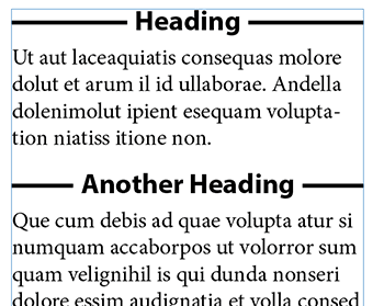
The Easy Way to Put Lines on Both Sides of a Heading
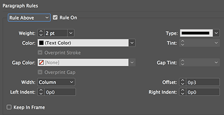
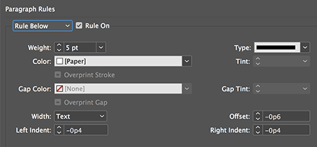
The easy, traditional method is to apply two paragraph rules to the text (typically as part of the paragraph style):
- a thin rule above with a slight offset to center it vertically on the line
- a thicker rule below set to the background color (normally Paper white), that “knocks out” part of the line above. To do this, you need a negative offset, a negative left and right indent, and the width set to Text
See the examples below:
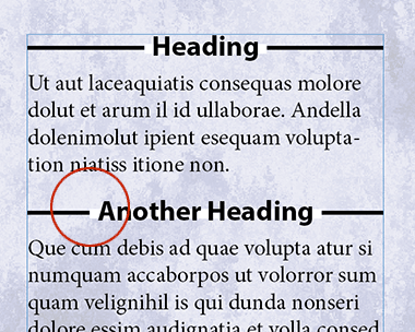
This method is fast and easy, but it has one negative result: it only works over a solid background the same color as the “knock out” rule… when it’s over another color, or an image, the knock-out just leaves a white or colored gap:
The Harder but More Flexible Way to Put Lines on Both Sides of a Heading
Fortunately, there’s another way. This time, we’re going to set up the paragraph style to be flush left, rather than centered:

Now, to center the heading, and add a little space between it and the line, we’ll add some text. In this case, I’ll use the Find/Change dialog box (GREP tab) to find everything in the heading paragraph style, and replace it with the same text, but with a tab and en space before it, and an en space and a right-align tab after it.
The code for “everything” is .+ and the code for the replacement is \t~>$0~>~y so it looks like this:
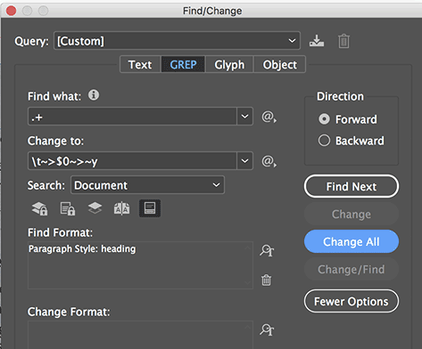
Notice that in the image above, I have used Find Format to limit the scope to just my heading paragraph styles.
Next, I need to change my heading paragraph style by adding a center-aligned tab stop in the middle of the column width:
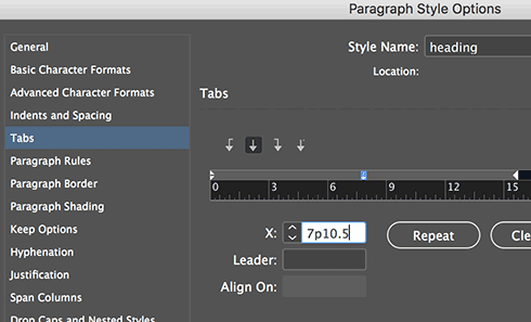
And I add a Nested Style that applies a “strikethrough” character style to the tab characters:
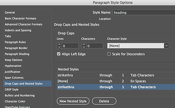
I could have used a GREP Style instead of Nested Styles, but my general philosophy is that if you can do it with nested styles, try that first.
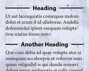
The result is a tab with a thick strike-through, followed by a blank en space, then the heading, then another en space, then another struck-out tab to the end of the line:
There are, of course, many other solutions to this problem: You could anchor lines into the text; you could use underscores instead of strikethrough; you could use scripting; you could add custom strokes with a huge gap and convert each heading into a table cell… but I think these two options are the simplest options. But let me know below if you can think of others!


No knock out problems if you use rule below and above and give either a massive indent, depending on the size of the text box. been using it for years..ish
Paul: Interesting… but don’t you have to adjust the left and right offsets individually for each heading to account for the different lengths of text?
Force Justify combined with the Flush Space character can work. I would say a GREP style for each Flush Space (e.g. the open “^~f” and close “~f$”). You would need a distinct GREP for each, since Flush Spaces don’t perfectly center the line (which is weak, but what can you do). So the first Flush Space would need to be tracked back to compensate for the centering. This is basically a variation on what you have here, but without being tied to a specific frame size or tab. Then the gap between the flush space is easily managed with empty-fill characters (not spaces, sadly) tied to their own distinct character style.
Hello Ben, I like your solution! You could change the width of the Flush Spaces to 1% in the strike-through-character style, that will center the text perfectly.
1% width on the flush spaces is excellent and eliminates the need for a different style for each flush space. Why does that even work?! InDesign magical thinking. So to sum up… flexible line lengths that grow with your text, no need for a fixed width text frame, and only two character styles — one for the flush spaces and one for the gap character. Thanks Godfried.
Hi there, can you provide a step by step for this please?
This is how I would do it:
1. type a flush space, after that a character that will function as the gap between the line and the text. e.g. the ‘§’. or another character you don’t use in your document. Then the heading, then again the § and finally a flush space.
2. make a strike-through character style for the flush space, and set the width of the character to 1%. Important to center the text properly
3. make an empty-fill character style for the §, so it will not be visible and acts like a space between the strike-through and the tekst
4. make the paragraph style for your heading, that is set to ‘force justify’ In this paragraph style:
5. make a grep style that targets the flush space and assign the strike-through character style to it
6. make a grep style that targets the § and assign the empty-fill character style to it
7. To adjust the width of the gap between text and line, play with the width % in the empty-fill character style
Honestly, David, what would I ever do without you and Anne-Marie. The other good thing about this solution is that it works in CS6 (and Mavericks!). Thank you so much, I’m most grateful.
Ditto Ann, great solution :D
I absolutely love this kind of article. I’ve recently used a part of the second method to have left aligned text with a line on the right, but the center-aligned tab stop thing is very clever !
Any thoughts on accessibility? It seems like the first solution would be compliant but the second one wouldn’t.
Could the knock out problems you refer to not be removed by changing the text frame’s blend mode to multiply in effects? Or does that have some adverse effect?
Hi thanks for this – method one works great for me. I created it as a paragraph style and used span columns so it stretches across my text frame which has 2 columns. My question is – is there any way that we can make a header like this automatically be placed at the beginning of each text frame in a given story? I have 3 text frames on each page and 2 of them need to be labelled with a header at the top of the frame (with the lines on each side).