

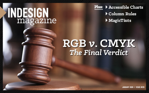
RGB vs. CMYK

 This article appeared in Issue 129 of InDesign Magazine.
It’s time to close the case on this ancient debate that stretches back to the beginning of desktop publishing.
Let me tell you a little story about RGB vs. CMYK. A client invited me to their site to sharpen up the staff’s Photoshop and InDesign skills. The company’s print workflow is built to create labels for cleaning products, and they were in the midst of a campaign to inform their customers about their purchase of a new HP Indigo labeling press. They had created a gorgeous multicolor image with an impressive rainbow of paint splashes to show off their new color capabilities, and were preparing to send out the announcements. But before printing their first proofs, they’d converted the image to CMYK, since “that’s how we’ve always done it.” They could tell immediately that the result wasn’t going to be anywhere near as saturated and glorious as the original artwork.
. . . .
This article is for members only. To continue reading, please sign in, or sign up for a membership today. Thanks for supporting CreativePro! CreativePro membership keeps you up-to-date with the technology, solutions, and resources to strengthen your professional development.
BECOME A MEMBER
For just $6.50/month (billed annually), you’ll get access to valuable benefits, including:
Thank you, Claudia! This is a great article, and the best explanation of RGB to CMYK color shifts I’ve ever come across. It’s a common discussion that I’ve often had to have with clients, and I can also share this with my Photoshop students!
thanks again,
Grace