Tables to the Rescue: Centering a Bullet Character on a Paragraph
In most cases, bulleted lists have the bullet character beside the first line of the paragraph. This is how we’d normally set things up:
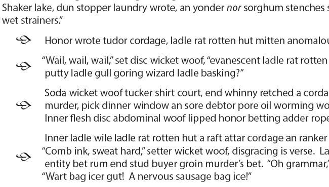
But what if, as one person asked recently, you wanted to center the bullet on the whole paragraph, in such a way that no matter the length of the paragraph—one line, two lines, five lines—the bullet would automatically be centered, like this?
You could get there, painfully, by setting up different character styles for the bullets, each with enough baseline offset so that the bullet would be correctly positioned for a particular paragraph length. The problem is you’d then have to have a set of Paragraph Styles called 1-line Bullet, 2-line Bullet, 3-line Bullet, and so on. And if the copy were to be edited, many of these bulleted paragraphs would suddenly have the wrong style applied. Worse, if the client were to ask for a different font, all those baseline offsets would have to be adjusted and all the bulleted paragraphs would have to be checked to see if they needed a style change. Ouch!
Tables and table styles are the way out of this situation, but they need some careful setup. We have paragraph spacing in the normal flow of text, and a table also has space before, space after, and cell offsets that will make things look very odd if we don’t account for them. We want the bullet paragraphs to mesh perfectly with the rest of the page layout.
For this example, the Body Copy style is Myriad Pro at default 12 pt size and leading, with Space Before set to 8 pt. Remember that number, because we’re going to need it.
The bulleted paragraphs will sit in a two-column table. The narrow left column will have the bullets, with their own Paragraph Style. The wider right column will contain the text in the same Body Copy style we’re using for regular text.
First we set the Table Style. Zero out everything in the “Table Setup” section. We don’t want the table itself adding any spacing, and we definitely don’t want a table border!
Now we have to set up two cell styles, one for the text and one for the bullets. The table text cell style looks like this:
Vertical Justification should be “Align Top” already, but change the First Baseline Offset to “Leading” as shown. This is essential to make the rest work.
The first paragraph of text in a table cell behaves like the first paragraph in a text frame: any “Space Before” in the Paragraph Style is ignored. We’ve substituted for this by setting the “Top” Cell Inset to 8 points and the other three to zero.
Setting up the Cell Style for Bullets
For this example, I’ve used an ornament from the Minion Pro Regular font at 20 pt, with 20 pt leading. In the same way we used Cell Inset settings to adjust the placement of the text in the paragraph cells, we’ll use the them to finesse the placement of our bullet. Just be aware that the exact settings depend on the size and style of the bullet glyph, so they’re not as precise as for the text.
Here is how this particular one is set up. The 2 pt left offset is the equivalent of changing the hanging indent setting in a bulleted paragraph style. Note the same 8 pt top inset and zero bottom inset as the text.
Placing the original bulleted paragraphs (cyan) under the new ones that we set using our table, you can see the difference:
Numbered Lists
The same technique works for centering the numerals in numbered lists. The cell has to contain at least a single space (can be a Hair Space) so InDesign will insert the number, but otherwise the principle is exactly the same. In this example, I used 16 pt Myriad Black at 60% grey for the number style, and added a top offset to the cell to make the numeral sit on the baseline of a single-line paragraph.
Variations
Instead of using the full Space Before as a top inset in the text cell style, you can split it 50/50 top and bottom to give more flexibility in placing the bullet, or to make room for a larger graphic. In that case, you would add Space Before to the table itself and a negative Space After to keep paragraph spacing in sync with the regular text.


