

The Zipper Effect

I spent some time this week cleaning up my stuff from 2011 and I came across a fun InDesign effect that I never got around to posting, so here it is for your amusement.
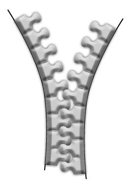
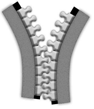
Behold, The Zipper Effect!
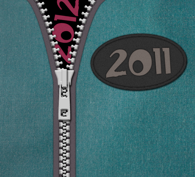
This is all native InDesign stuff, with the one exception of a photo of some denim fabric.
The key to making the zipper is placing the teeth as inline objects along a path so they’re spaced evenly and curve along with the path when you reshape it.
To start, we need to draw the first tooth. The web can provide plenty of good tracing examples for all the zipper parts, including the teeth. Using the Pen tool, trace one zipper tooth.

To get it perfectly symmetrical, you can just draw one side then hold option/alt while you click the Flip Horizontal button in the Control panel.

Then join the two halves together by selecting the endpoints you want to join with the Direct Selection tool and choosing Object > Paths > Join.

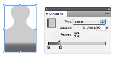
Then give the tooth a fill color. I chose a gray gradient.
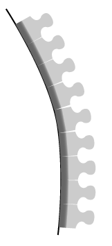
Now it’s time to put teeth on a path that will give shape to the zipper. Using the Pen tool, draw a straight path the length you want the zipper to be. Copy the zipper tooth you drew. Then with the Type on a Path tool, click and drag on the path to set the endpoints for the zipper and paste the zipper tooth onto the path.

Then paste as many copies of the zipper tooth as you like.
By reshaping the path (or adjusting the Type on a Path endpoints) you can lengthen or shorten the zipper, and adjust the spacing between the teeth.

Using the Direct Selection tool and/or the Pen tool, reshape the path to make it curve.
To make the other side of the zipper, again hold option/alt while you click the Flip Horizontal button in the Control panel. Then nudge the copy into place so the teeth fit together.

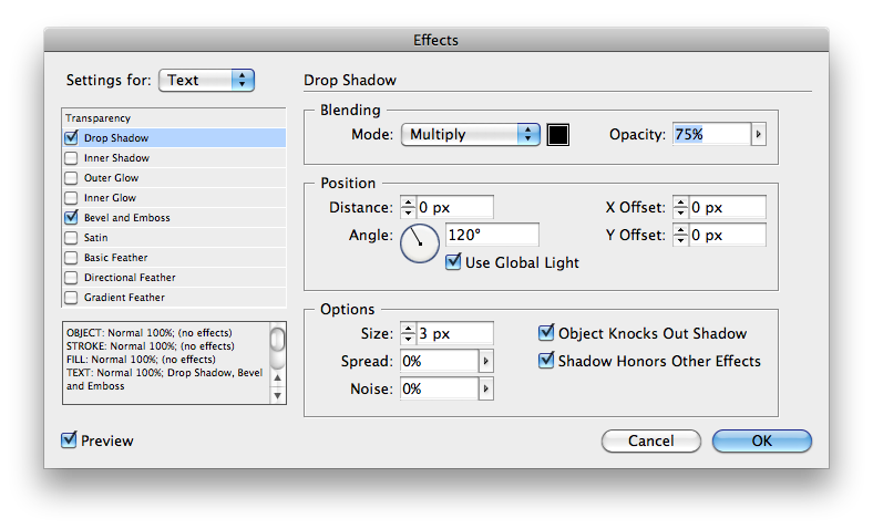
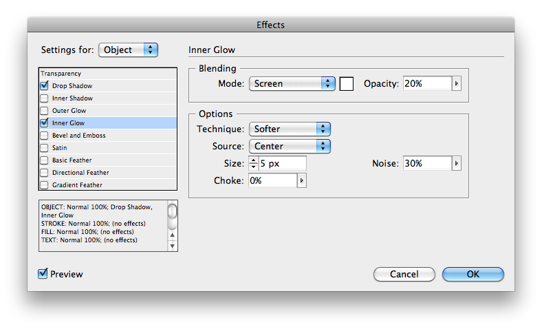
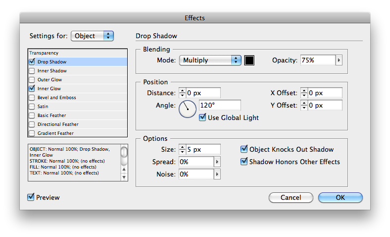
This would hardly qualify as an InDesign effect without a trip to the Effects panel, so next apply a bevel and emboss plus a drop shadow at the Text level to give the zipper some life.

Next increase the width of the stroke to simulate the tape that holds the zipper teeth together.
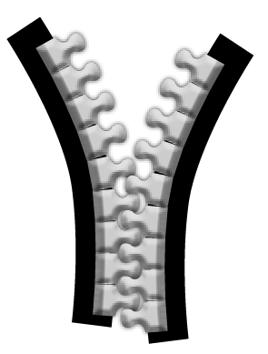
If you want to make a fancier, two-toned tape, copy and paste the whole zipper in place. Then with the new copy still selected, choose Type > Type on a Path > Delete Type From Path.

Then in the Stroke panel set the strokes to align to the inside and change their color or tint.

I also added a noisy inner glow and a shadow to give the new tape some texture and thickness.
Next we need to draw the zipper pull. Tracing a good photo will make this a quick job. And the same bevel and drop shadow effects that were applied to the teeth will work nicely here.

To finish the job, move the pull in place, put some content where the zipper is open, and a photo of some fabric behind everything and you have the Zipper Effect!
Here’s an IDML file of the zipper effect that you can open with InDesign CS4 or later.
Zippy New Year!
ha-ha … nicely done :)
Happy New Year Mike!
Nice final result.
Very cool effect! I used to create graphic necklaces using the same technique (vector circles on a text path, etc.), applying negative tracking to create an overlap between each circle, resulting in an almost 3D perspective.
I never thought to create a zipper though! :)
InDesign never ceases to amaze me with all it’s bells and whistles!
Happy New Year folks!
Yeah. Cool effect. Grateful guys.
was great
thanks
Very nice. I made a small zipper but did not think of doing it that way. And I love the inline graphic function!
That’s awesome!
Just to complete it, did you know you can actually make a reasonable facsimile of a denim texture quite simply in ID?
Start by making a custom stroke style – Dashed, Length=.02 in, Pattern Length=.05 in
Now draw two lines, perpendicular to each other, in a cross shape. Set the stroke weight of both to say, 300pt, and the stroke style to your new custom style.
Finally, give your strokes a Basic Feather effect, Width=.05 in, Choke 0%, Corners: Diffused, Noise=50%
With a little finessing you can make something like this (www.dropbox.com/gallery/16129961/1/Denim?h=48af36)
Cheers!
Chris
ohhh, indesign is for people that don’t have photoshop.
Updated link for above post (if anyone is interested).
https://www.dropbox.com/s/6f5d5x6w18dh1j7/Denim.jpg
Chris