

TheSansMono: A Great Monospaced Font

Monospaced fonts are faces in which each character has the same width. The most famous of all, of course, is the faux-typewriter style Courier (or Courier New or some other version of Courier). But you wouldn’t really use that, would you? (Well, perhaps in a cheezy direct mail piece that you wanted to look typewritten… but not in a book or magazine or anything professional-looking.)
Instead, if you need a monospaced font — for writing code or something like that — you want to try something else. Here is a list of some of the most common monospaced fonts (in other words, the ones that I had sitting on my computer because of the Mac OS or MS Office or who knows what):

Notice that every line has the same length because each of these has the same “pitch” — that is, the number of characters that will fit in an inch. At 12 points, these fonts are all 12 pitch.
When Olav Martin Kvern designed Real World InDesign (he did version 1.5 by himself; I came onboard for version 2, if I recall), he knew he’d need a good monospaced font for code samples (scripting, XML, and that kind of thing). His excellent choice: TheSansMonoCondensed, designed by Berlin-based Dutch type designer Luc(as) de Groot, and sold by LucasFonts and elsewhere.
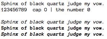
It has so much going for it… it’s condensed, which just looks better; it has a higher pitch, so you can fit more text on a line; it comes in eight weights (plus italic versions of each), so it’s really versatile; and it’s cool-looking. Here’s a selection:

I will admit that the folks at LucasFonts were kind enough to give us a copy of the OpenType version of the font family recently, but Ole and I have have been recommending this font for years and their generosity didn’t change that.
So, the next time you’re in the mood for mono, check it out.
It’s just a shame most of these high profile fonts (coming from big-name foundries) cost so darned much. They’re the hardest part to sell to a client at any price, but when a font collection costs hundreds or thousands of Euros (like Din, Helvetica and TheSans) it’s impossible to justify the cost.
Instead I go to myfonts and look for new, low-priced gems that can be used multiple times. That way I can spread the cost more easily.
That’s not to say the TheSans family isn’t a great font. I own a few styles of the regular (unfortunately postscript) version. But if it wasn’t for one client who already had a corporate ID that used them, I never would’ve bought them, especially if I hadn’t been able to get the client to pay for them…
@Roland, I appreciate the need to keep costs down. However, it appears that you can buy a single face from TheSansMono for about 60 euros at https://lucasfonts.com/shop/ . That seems very reasonable for a font that you can use and re-use in many projects.
A worthy monospaced font — one that’s open source (licensed under the SIL Open Font License (OFL)), so it’s free — is AnonymousPro by Mark Simonson. It’s not condensed, and there are only the 4 basic styles, but if that’s okay with you it deserves a look.
https://www.ms-studio.com/FontSales/anonymouspro.html
Mark says, “Anonymous Pro (2009) is a family of four fixed-width fonts designed especially with coding in mind. Characters that could be mistaken for one another (O, 0, I, l, 1, etc.) have distinct shapes to make them easier to tell apart in the context of source code.
Anonymous Pro also features an international, Unicode-based character set, with support for most Western and European Latin-based languages, Greek, and Cyrillic. It also includes special ?box drawing? characters for those who need them.”
Here’s a sample:
I want to use Andale Mono, or something very close letter shapes. I want the deconstructed look for a layout. BUT the spaces between words are a problem … I have not been able to find any fonts with similar letterforms and normal spaces.
Is there such a font? or is there a way to make ID alter just the spaces?
Thank you!
Suzette
OS10.6 ID CS4
Normal spaces? Well, you could select the text and select Optical from the kerning pop-up menu. And you could use the Justification dialog box to set the Optimal letterspacing to something like -5%. Looks odd to me, but you might make it work.
I realise I’m posting a comment on a very old post. However I am currently designing printed forms with variable data printed on them which use monospaced fonts. This article was great for me since I had no idea about the pitch concept of these fonts.
Anyway, I believe there is an error in this post. Letter Gothic and Courier 12 pt will only fit 10 characters in an inch. To fit 12 characters the size needs to be 10 pt. Please correct me if I am wrong.
Regards
Daniel
Daniel: good catch! Yes, at 12 point, Courier (and others) have a “10 pitch.” Other monospaced fonts have higher pitches at that same size.
Hello David, I need a monospace condensed font, (like to the condensed font of 17 or 20 characters per inch), of the epson dot matrix printer.
Can you help me to find this type of font?
Thank you, I wait your answer.
Chirstian
@Christian: No, sorry… I would suggest just doing a web search for “monospace condensed font epson” or something like that. Good luck!