

Tip of the Week: Making Custom Accented Characters

This tip was sent to Tip of the Week email subscribers on April 14, 2016.

Sign up now and every week you’ll get a new InDesign Tip of the Week and Keyboard Shortcut of the Week, along with roundups of new articles at InDesignSecrets, plus exclusive deals sent right to your Inbox!
Just scroll all the way down to the bottom of this page, enter your email address, and click Go! We’ll take care of the rest. Now, on with the tip!
Need an accented character that doesn’t exist in the font you’re using? You might be able to create your own custom accented character if the font has the floating accent. Use the Glyph panel (Type > Glyphs) to browse the font for the accent.

Add the accent after the character in the text, by double-clicking the accent in the Glyphs panel. Then use baseline shift and kerning to center the accent over the character.
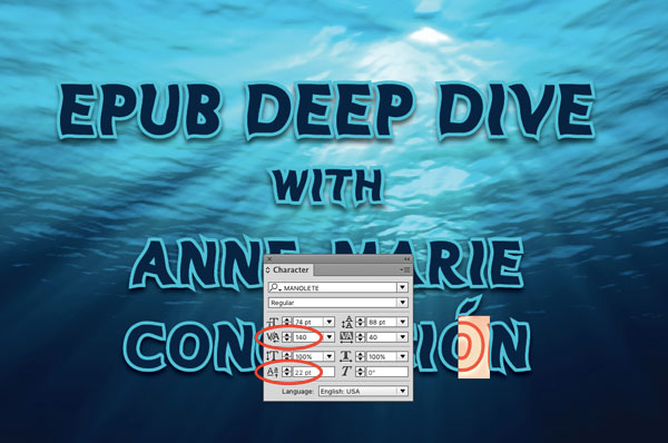
You might also need to increase the kerning between the accent and the following character to compensate.

I’ve always done that, but recently, we’ve had a publisher tell us not to do that. That if we get weird accents, we need to find a font that has it and that is also a close match to the rest of the type (which can be very hard to do).
If not–that person apparently expects us to change the entire font for the job so that accent is available. And that is impossible in book publishing. The designer is not going to redo an already approved sample with a different font for the sake of a handful of special accents that are not available. Nor, have me (and the company I work for) re-do the entire book if the author or editor adds words with special accents on third or fourth pass.
The rationale is because of eBooks. The fake accents won’t appear correctly they say.
I’m wondering if converting those accents into outlines or as a piece of art (and anchoring) might work.
I won’t say much more, just in case that person visits these forums. But–I believe that person knows only about eBooks and NOT the entire process (including InDesign).
Dwayne, you make an excellent point about ebooks! This would certainly not work for an ebook.
But the problem, David is that a lot of print books become eBooks. They’ve got to find a way make things smoother when converting books for print into eBooks.
Right: so this tip might not be as good when you’re laying out a book that will become an ebook. In those cases, you should make use of a font that has a very large glyph set, including accented characters. (Or create your own font, as Franck pointed out)
But the tip is great for ads, brochures, and many other uses for InDesign.
That might sound like an advertising, but I think it’s exactly where indyFont could come into action (see the link i posted under my name).
That’s the reason why Marc Autret (indiscripts) built it : a lot of english-speaking fonts were lacking accents and that is really impossible to use in french (and other languages as shown by AM). Of course, it would be better to use another font, but if the only thing that goes against a design choice is the lack of a few characters…
That’s true, David. Unfortunately I’m at the mercy of the designer and publisher. Many times they don’t even know about those weird accents until I inform them of it. And by then, it’s too late to change fonts. And I will check out indyFont that Franck pointed out.
And the tip is definitely great for ads, brochures, etc. And that’s why I was doing with print books until eBooks threw that curveball.
Great tip! As a latin designer THIS IS SO USEFULL! Sorry for all the yelling but I´m so exited. Thanks Mike! Excellent tip. As David says, for headlines and short pieces of text it´s pretty hot! On the other hand, for ePubs and large text, by experience, again, as David sais, look for a huge font with accents and all, not all the fonts has it, specially “artistic” ones.
Greetings!
Ray, what you’ll want to get is Peter Kahrel’s free script, Compose. It lets you enter the 2 characters you want (like O’) and when you hit return, it does the kerning/tracking/baseline shifting for you.
I wrote about it years ago here:
https://creativepro.com/easy-diacritics-and-other-tough-glyphs.php
… and I was happy to see he’s kept it up to date and it still works with CC 2015 (though the script is called ComposeCS3.jsx).
https://www.kahrel.plus.com/indesign/compose.html
Chances are if a PDF is made using this trick, the text/accent in the PDF will be substituted with postscript or outline/vector data. Making it unavailable for search (in the PDF file); and if a tool like PDF2ID were ever used to convert the PDF back to ID format the character/accent wont be recovered.
excellent tip, boss!