

Delete all line breaks?
Learn / Forums / General InDesign Topics / Delete all line breaks?
Tagged: justification, line breaks, margins, orphans, widows
- This topic has 9 replies, 3 voices, and was last updated 9 years, 9 months ago by
Andy Mcgroarty.
-
AuthorPosts
-
-
July 5, 2014 at 1:54 pm #69313
Andy Mcgroarty
MemberHi there
I am trying to try minimize the widows and orphans in a book that i am working on using different methods like margin size, justification settings etc and i wondered if there is a way to delete all the line breaks i may have made in the document in one go? Or do i have to switch on ‘show hidden characters’ and delete them manually?
Thank you and best wishes
-
July 5, 2014 at 2:50 pm #69314
Anne-Marie Concepcion
KeymasterYou can do a Find/Change to delete them all. Find: ^n (that’s the code for a forced line break) and leave the Change blank. Choose Document in the dropdown so it does the find/change in all the stories, rather than only the active one.
A bit of advice, sometimes I force a line break between words and delete the space between them. When I delete all forced line breaks then some words end up concatenated likethis. So instead of just deleting them, I usually replace all forced line breaks with a single space, then I do another Find/Change that changes all double spaces to a single space.
AM
-
July 5, 2014 at 4:50 pm #69318
Dwayne Harris
MemberDitto what Anne-Marie said.
I gotta admit it drives me crazy when folks delete the space between words and put in the soft return. At our company we always keep the space in there and put the soft return AFTER the space to avoid these issues.
And it’s even more complicated when they use a soft return after a hard hyphen. When that happens–you’re pretty much screwed as you can’t automatically fix those. You have to determine it individually. That is a pain in the ass.
I always search for space + soft return and replace with a space.
Then, I search for any letter + soft return, and replace with a color not used in the job (let’s say “red” for this example).
Then I search on the hyphen + soft return and waste an hour or so determing if it’s a real had hyphen or if it should be removed.
Then I search and replace a red soft return with a space and back to black.
I know it sounds weird–but you can do a lot of stuff with searching and replacing by using a color in the search and find replace fields. You’d be amazed at what you can do.
At our company we try to avoid soft returns whenever possible. We use the “no break” feature and actually use a character style that only does that.
-
July 6, 2014 at 8:54 am #69323Member
Thank you Anne-Marie and Dwayne for your invaluable advice as usual.
It didn’t know this was such a problem for some folks, this thread is particularly interesting: https://forums.adobe.com/message/1289135
Thankfully i don’t seem to be in the bad habits that you have mentioned, phew!
But having looked into this a little issue more i’m not sure i’m using the right terminology, i think widows and orphans is close but what i’m talking about is not so much the odd word, but a whole line of text of a new paragraph at the bottom of the page, or a whole line of text at the end of a paragraph on it’s own at the top of a page.
I was under the impression that you shouldn’t leave them on their own and either use a line break to put the line of text on the bottom of the page onto the next page, or use the line break to put the previous line at the bottom of the page on to the top of the next page.
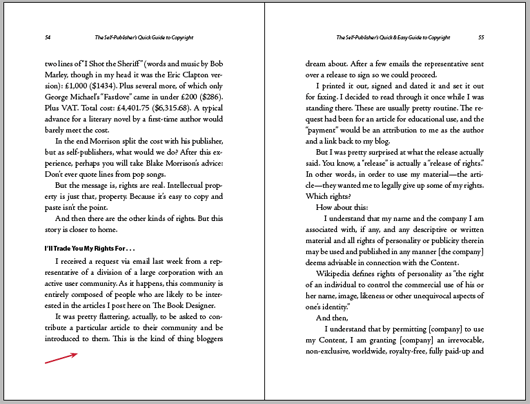
But this means that on quite a few pages the bottom of the page is uneven, either one line short on one side or the other, like in this image: https://www.thebookdesigner.com/wp-content/uploads/2010/10/spread2.png And I gather from this article: https://www.thebookdesigner.com/2010/10/pagination-styles-shall-we-kill-the-widows-orphans/ that this is a contentious issue. Like i said i am experimenting to try and lessen this from happening, but i wondered if i could draw on your expertise and experience to see what your opinion is about this.
Thanks again and best wishes
Andy
-
July 6, 2014 at 11:41 am #69328Member
Hey Andy
I always refer to widows as the last line of a paragraph at the top of the page. And an orphan as the last word of a paragraph on it’s own line. However, if it’s more than 4 characters (excluding punctuation), then it’s fine. We normally try for a whole word down (and a few publishers want a full word down, but will allow it to be hyphenated if it’s a very long word).
I looked at your links, and:
1) We always require a minimum of two text lines at the top of the page. The last line of a paragraph is not acceptable at the top of the page. It has to be at least two lines.
2) We allow the first line of a paragraph to end at the bottom of the page (I believe it’s the second link you provided where they refer to it as a widow). We allow it, and so do most publishers (at least with the ones we work with).
With that being said, sometimes you get an old-time editor or proof reader who doesn’t like those things, and they will mark them as PEs (printer errors). They aren’t, as the publishers allow them, but they sometimes get marked when 1st pass is sent back to us for corrections. We cross them off and ignore. We do check with the publisher first, however.
And although you didn’t ask, I will say that we always require two lines of text above and below text elements such as space breaks, extracts, bulleted lists, verse/prose, numbered lists, etc. And two lines of text above and below any element that has space above and below it. We pretty much go by the rule of “two,” except when it comes to the first line of a paragraph ending at the bottom of the page. That is when it’s regular text. LIke I said, if there is space above it, then it’s two.
Sorry for rambling. In the case of the second link, we don’t consider what they termed a widow as unacceptable.
Also–in book pagination, we are allowed to either go one line short or one line long on spreads to avoid bad breaks (this depends upon the foot margin and the page count wanted). So to avoid the last line of a paragraph falling at the top of the page, we can run the spreads either a line short or a line long. Normally, you can’t have three spreads in a row that are short or long, and you can’t mix and match. It’s either shorts or longs. But normally, we would try to make or lose a line in the text to avoid running shorts or longs.
And, of course, that’s why we use the “keep together” option in the paragraph style sheets. We normally use 1 and 2 (one at bottom and 2 at the top). Some designers refuse to use that feature, which makes no sense to me. By using it, InDesign will show you the bad breaks.
-
July 6, 2014 at 12:57 pm #69329Member
Thank you Dwayne. That is really interesting reading about your method, it is almost like a half way house between both approaches outlined in the article. I went for the ‘not to square’ approach in my first books. But i might try giving your method a go, seems sensible.
I don’t mind the rambling at all! it is really useful to hear about all the nuances involved, every little really helps.
Best wishes
Andy
-
July 6, 2014 at 1:11 pm #69330Member
Glad to be of help Andy, and I’m glad you appreciate it :)
I think you are safe with remembering the “two” thing. Two above and below everything (except for the first line at the bottom of a page).
-
July 6, 2014 at 1:23 pm #69331Member
Brilliant! Just out of interest what does the old-time editor or proof reader expect to see?
-
July 7, 2014 at 3:57 am #69340Member
Well, normally no more than two hyphens in a row, double-hyphenated words breaking at the end of a line, loose lines or lines that are too tight. That’s what most proof readers look for. It varies with some of the old timers. They worry about kerning between this or that letter, when it’s really pretty much okay the way it is. They tend to get too picky.
-
July 8, 2014 at 1:37 pm #69376Member
Ok, i see, interesting. Cool, thanks for sharing Dwayne
-
-
-
AuthorPosts
- You must be logged in to reply to this topic.