

Understanding the Stacking Order of Paragraph Rules

During the CreativePro Week 2019 in Seattle, I attended sessions featuring Tony Harmer and Jason Hoppe on the topic of creating better infographics. I was interested to see how bar-chart information was presented in the demonstrations, and wondered if these appearances could be combined with the GREPGraph technique to make bar charts that are not only live, but visually appealing as well.
The good news is: yes it is possible to make a huge variety of effects.
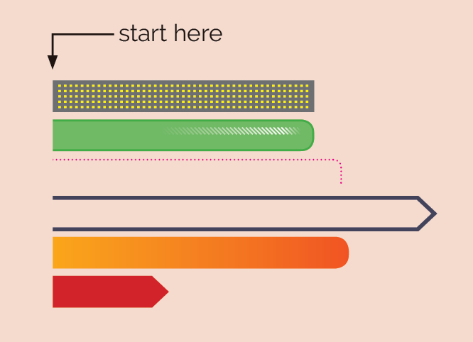
But this is not just limited to the GREPGraph technique, and can be used in general layout as well. Using combinations of Rule Above and Below, Paragraph Borders and Shading, Underline and Strikethrough, as well as the Auto-size text frame option, it is possible to create some very interesting live lines:
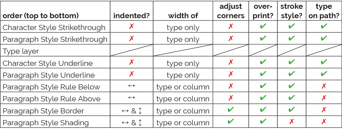
What I found most confusing in this process was the stacking order of these effects. Does an underline appear above or below a paragraph rule, and so on. So that no-one else has to experience this confusion, I’ve gone to the effort of preparing a chart that outlines the stacking order and behavior of these effects:
Note that it is also possible to combine these effects with the following items to make the appearances even more interesting:
- Symbol fonts
- A mix of paragraph strikethroughs/underlines AND character strikethrough/underlines, using fixed-width fonts such as Courier
- GREP styles to alternate between strikethrough and underline at the character level
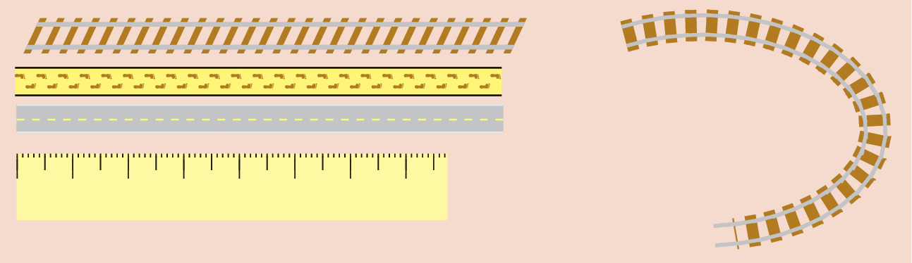
- Stroke styles to control dashed lines to make precision items such as rulers
- Gradients
- Transparency effects
- Type features (such as skew)
- Anchored objects
An example shown recently on the adobe forums uses these principles to create a line behind type that features an arrow style design that points to the right: https://forums.adobe.com/thread/2641246
Awesome, Colin! I love your way of think solutions like this! I usually use simple frames to create the charts when I need them, and then I wrote a script to help me resize them properly (https://www.youtube.com/watch?v=quXCl-zipJ0).
Thank you for this chart! I often use these combinations, but never took the time to compare all options (usually trial and error to get it right). About the paragraph style rules, you can use a positive or negative offset instead of vertical indents.