

Using Paper Color to Help Distinguish Various Files

I’m currently working on a complex manual regarding a marine electrical system. This particular manual has many similarities to three other manuals I have done in the past, but it’s not exactly like any one of them. When I’m working on a project like this, I find it helpful to keep several of the previous documents open for reference. But since all the documents look so much alike, there have been times when I’ve lost track of which one was my “working” document, and I ended up editing the wrong one.
But today I came up with a way to distinguish between the working document and the reference documents. I simply change the CMYK values of thePaper color swatch. (To do this, double-click on the Paper swatch in the Swatches panel.)

Paper: White
I edited the Paper swatch for each of the three reference documents, making them appear blue, pink, and yellow onscreen.
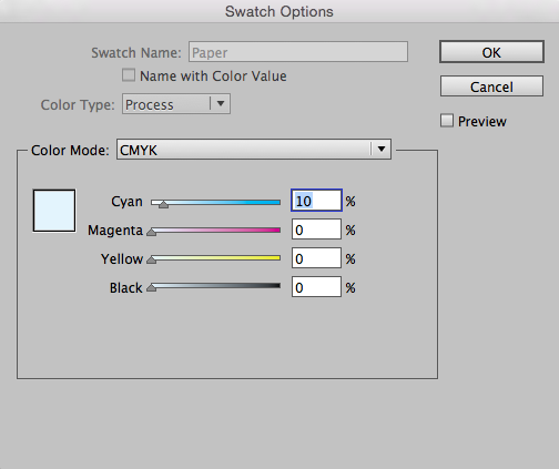
Paper: Blue

Paper: Pink
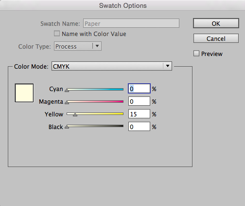
Paper: Yellow
Now, when I toggle between the three documents, I’ll never mistake any of them for my working document.

This is simple yet brilliant. I can’t count how many times I have made mistakes working on too many docs at once, this idea will save me a lot of trouble. Thanks!
excellent!
Awesome tip! I was just doing work on a directory with R1 open for reference while working on R2; they look very similar so changing the paper color is a super easy way to keep them apart! Especially for an OLD version that you’re not going to use anymore; the minute you open it you know it’s the old version.
Good idea. Many years ago, when I worked for a publication that still sent out paper proofs, we printed them to coloured stock to distinguish preliminaries from finals and so on. Much the same notion.
What a great tip! Thanks for sharing!
Good idea.
For an alternative, e.g. if the pages in the document are already coloured, try adding a light tint of “OLD VERSION” in a large font size, diagonally across the master pages.
And for filing purposes, adding the word OLD to the start of the file name works wonders.
I’m assuming you would need to reset the paper colour to 0,0,0,0 before sending the document to print, otherwise any white would be coloured?
Thanks
Chris, No, that’s the beauty of this trick is that the documents are only colored on-screen. If you did, in fact, want the pages to also print out colored, you would need to have another workaround. But this works great for on-screen viewing.
Here’s a bit more on the Paper color: https://creativepro.com/how-to-change-the-color-of-the-background-paper.php
I may have been using ‘Paper’ wrong all these years then, as any white copy in my document I set to Paper. Is that incorrect? If so I feel stupid.
Thanks
Chris, you are doing it exactly correct! Here is a great article that explain the white paper switch: https://creativepro.com/indesigns-paper-and-registration-colors.php
Honestly, the only reason I can think of to use a “White” color swatch (as opposed to InDesign’s [Paper] swatch, is if you were actually printing on a non-white substrate, and had already designated the [Paper] swatch to simulate that color. So then the “White” swatch would represent the white ink you’d actually be using. It you’d set it up as a spot color.
But for every other instance, the way you describe it is exactly correct.
Chris- As Kelly said, you’re not stupid! It’s the, ahem, stupid name of that default swatch that confuses things.
Absolutely brilliant! I’ll definitely be using this next time I’m comparing my typeset files to my sample pages. Thanks so much.
That is a great, and will help with categories of projects. My method: I precede every file with today’s date. Today is 82417. Its a macro I press as I write file names. During tight production, the only thing that matters is which version the file is. If I have two or three versions in one day with ever-changing clients, then my file names start to begin with 82417a, 82417b, 82417c, etc. I couldn;t survive on background color alone when there or 4 or so versions of a project in a hectic day
Great idea! I had been trying to distinguish old versions and current/active doc by turning on the document grid view for the old versions. But colors do this even better.
That is a beautifully quick, clear, and useful tip. I will share it tomorrow with my students–with credit, of course!
Had a eureka moment. Cant believe never thought of this. Thanks!
Super and so delightfully simple and useful. Thank you.
what do you do when you get a file and the creator of the document uses “Paper” as a color for white type on a colored background (oh by the way this is a neeto tip) Thanks
This tip is designed as an easy way to compare very similar documents. I would not recommend changing the CMYK values of the paper swatch of a working document. Just use this tip to change the CMYK values of an older document that you’re referring to. Because the new Paper color will just be for reference, it won’t affect your working document. Besides, changing the Paper CYMK values don’t affect how anything will print. It just affects how the document is displayed on-screen, within InDesign.
Juanjon, what your file creator did, using Paper as the color for white type on a color background, is correct. That’s what you’re supposed to do. And you can still change the color of the “Paper” swatch with no ill effects. It simply means “knock out all color here” so the paper color that you’re printing on will show. By default InDesign assumes you’ll be printing on white paper. So even if you changed the color of the Paper swatch to Purple, you’re not going to get Purple in the printout or when you export to PDF (which assumes white for paper).
Excellent! I just finished a long conference program guide that was based on an older file. Next time, paper color will be a big help.
Yes, brilliant! I will do this, it will prevent overwritin an old file.
Thanks, Kelly!
I figured out a similar way to do this in Acrobat/Reader! https://documentgeek.blogspot.com/2017/11/use-replace-document-colors-to-help.html
That is the most awesome thing I learned today! Thank you!