Why Can’t I Get Dot Leaders to Line Up?
Diane wondered:
Sometimes (it was this way in Quark, too), the space before leaders is different on different lines. There shouldn’t even be a space there but it looks like there is.
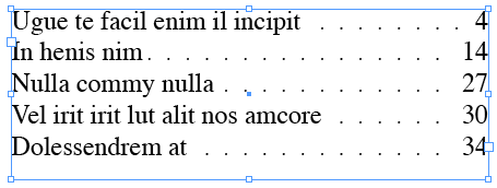
Yup. It has always been this way, and unfortunately it probably always will be. Here’s an example:

Look at the spaces to the left of the dot leaders (before the dots). On the first line it’s like there’s a huge space there; on the second line it’s really tight. Frustrating! Why does it work this way?
It’s because dot leaders are always set right-to-left, and it does that because it’s trying to ensure that all the dots (on each line) line up vertically. See what I mean? Each dot lines up with the dot above/below it. That’s lovely. But in order to create that nice effect, something has to give — and in this case it’s the space on the left.
If you don’t like how tight that dot is on the second line, you could place a space after the text. That makes that first tight dot disappear. But then the second dot looks a bit too far away.
The only other solution is to adjust the tracking or size of the dots. I like assigning a character style to the dot leaders (using nested styles or grep styles or whatever). Then you can make the dots smaller and space them out. Edit the character style with the Preview checkbox is on, and you’ll see that tiny changes make a big difference. Then it’s just a matter of trial and error.


Gah! I will try some of the things you mention at the end there even if it might screw with the spacing on the leaders. Im ok with that but some customers might notice it. I let my proof reader know why we cant always fix it.
Thanks for the speedy delivery of your answer, David.
Diane
Hey great tips there and good explanation of why this happens, I’ve always wondered.
However, another workaround would be to use a Strikethrough in the Character Styles for the Tab (You could use underline too, but you may be using that for something else or something?) Anyway in my example I’ve used Strikethrough. You’ll see that the dots marry up to the text, and you can still adjust the tab on the right.
See screen shot attached
https://tinyurl.com/6lz7ub
The only problem is when you insert text after the tab the text also has dots under it, so you’d have to make a Paragraph Style with nested style that goes
None up to 1 tab character
Tabs through 1 tab character
None up to End Nested Style
or similar
Cool idea, Eugene!
Yay!!! Thanks David.
@David: “It has always been this way, and unfortunately it probably always will be.” No. Adobe just have to write us a new setting which will Align/Don’t Align tab leaders.
But thanks for enlightening us on this issue, David, as I have long been annoyed by this seeming glitch — and I never noticed until you pointed it out that the leaders align vertically! That makes me strongly suspect that non-vertically aligned tab leaders would, in a great many cases, be inoffensive and, often, preferable to the odd space-issue.
I have on my lonesome own concocted a Nested Styles approach to solve this, quite similar to Eugene’s, so it’s not utter rocket science to overcome this glitch.
Nice, Eugene…and I like the screenshot. ;)
Thanks Bob. I’m still working on that rocket though :P
I have noticed this lovely ‘feature’ before, too, but never paid much mind to it. It doesn’t bother me too much and I think that misaligned dots going down the page would be more disorderly. The ways you guys have thought of to get around the problem are creative though! Cool!
To me, the solution to this problem is obvious.
Uneven dots look ugly.
Uneven spaces after the text look ugly.
Solution = adjust the tracking of the text.
The difference will barely be visible given how little the adjustment needs to be.
@Lee: I like that solution! Either tracking or just increase word spacing a bit. It’s be cool if there were a script or an option in the UI to do this.
I have a problem with leaders, and I’ve seen this question around the web many times, but I’ve never seen an answer.
Is there anyway to set a minimum space for the leaders?
Example:
Medium length entry . . . . Acts 4:26
Extremely long entry
with turnover . . . . . . . . . 1 Sam. 2:1
Short entry . . . . . . . . . . . . . Acts 9:5
Really annoying long entryActs 2:8
See my problem? “Really annoying long entry” not only doesn’t have a leader, it doesn’t even have any space between the text. The text on the right is different lengths and right aligned, and as long as ID can squeeze it all on one line, it will. But then I don’t have a leader, so I have to insert a soft return (in this case before the word entry) to get a leader.
I have about 3,000 entries, and not nearly enough time to look at every one of them and insert soft returns where needed.
Any ideas?
@Lemonshrew: I know what you mean, but unfortunately there is no way to specify a minimum tab leader size. It might be scriptable. I think it’s a cool idea to add that kind of feature to the program, though.
Thanks David!
I think it’s a pretty common problem, I know it is for me.
By, the way I said in my first post I had 3,000 entries.
I wish!
It’s 20,000.
It’s going to be a long weekend!