Why Placed Color Images Can Appear Inconsistent
You place two images that have identical colors in them… but they look different! This can drive you crazy. While there are a number of possible solutions, the most likely problem is: There’s a color profile mismatch somewhere! And often that mismatch is due to the fact that one or more images does not have a color profile embedded in it.
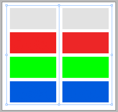
Here’s one common example: I’ve placed two images into InDesign… the images appear to be identical, but there’s one important difference: one of them was saved with a color profile embedded in it, and the other was not (also called “untagged”).

Now, you probably can’t tell the difference right now, right? On my screen there is a very tiny difference. But when I choose View > Preview on CPU (which turns off the new—and slightly buggy—GPU rendering), you can see the differences more:

OK, now look what happens when I turn on View > Overprint Preview:

Holy mackerel! Remember, those two images look exactly the same in Photoshop; the RGB values are identical. So why do they appear so different? (If you don’t care and you just want to fix it, skim through the next section and head right for “What to do about it.”)
Tagged vs. Untagged Images
The reason is that InDesign knows what the colors are supposed to look like in the tagged image (the one with the color profile in it), but it has no clue what the colors look like in the one with no profile.
This is why the colors may look really different when you import an image you found on the web, or exported from some simple pixel-editing program. If there’s no embedded profile, then InDesign has no idea what the colors in that image are supposed to mean. And in those situations, it applies its default RGB color profile.
Now here’s where it gets interesting. InDesign’s normal “default RGB” profile is sRGB, but Adobe makes a big stink about how you should make sure your RGB and CMYK color profiles are all the same in Photoshop and InDesign and Illustrator. And so a lot of people synchronize all these settings, and the result is that InDesign’s default RGB profile gets changed to Adobe RGB or some RGB other than sRGB.
And that is a problem.
As I wrote over a decade ago, it’s a good thing to have your programs unsynchronized, and have different RGB defaults!
You almost certainly want your InDesign documents to have a default RGB profile of sRGB. Because when you use sRGB, then all those web images and images from other less-reliable-than-Photoshop sources will probably look right when you place them.
(By the way, you do want your default CMYK profiles to match among all the Adobe programs. I’m just saying it’s okay if the RGB profiles are different.)
What to Do About It
OK, so what can you do about this problem? Here are a couple ideas:
- If you can, try to ensure every RGB image has a color profile saved with it. Photoshop saves profiles by default in the Save As dialog box, but it’s off in Save for Web.
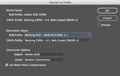
- Check to see what your InDesign document’s default RGB profile is. This is harder than it should be. You can find it by choosing Edit > Convert to Profile:

But don’t change the profile here! Convert to Profile is good for learning about the document, but it can cause bad things to happen if you change anything here. So if it says Adobe RGB or something like that, and if you want to change it to sRGB, then click Cancel here, and then choose Edit > Assign Profile:

Here you can assign the sRGB profile and then click OK. Now, every RGB image that does have a color profile embedded should look the same, but all the RGB images that have no profile will update and probably look far better.
(Note that this only changes the currently open document. If you want to ensure new documents are set up with the correct profile, use Edit > Color Settings.)
I know this seems crazy and technical, but the important lesson is: when colors don’t match, then it’s almost always a problem with either the profile not being included properly, or it not being interpreted properly in InDesign. Fortunately, these little steps can go a long way to helping you get consistent color!


Good article on an important subject. Would you please do a follow-up article on colour issues related to placing Illustrator files in InDesign? I have many times had colours go squirrelly when placing, for example, logos in AI files in an InDesign document.
Brad: Good idea for an article. In the meantime, I do talk about this in some detail in my title “InDesign: Color Management” at Lynda.com/LinkedIn Learning.
Good article, thank you! I read an older article about grayscale images and how ID does not color manage them at all. Is this true still with CC? Any use soft proofing grayscale in InDesign, or should one just make a PDF and check it there?
Annukka: No, there have been no changes in InDesign’s grayscale color management that I know of.
That GPU rendering on Mac… it is problematic to say the least. It is inaccurate in transparency display (Knock Out Groups) and showing colours when not in Overprint preview. Better to turn CPU on instead of GPU…
most of my brochure looks good (mostly dusk/early twilight images). In one large image in particular
the beautifil blue sky at dusk looks like a faded/dirty blue – i’ve assigned the same srgb profile to the document and the image – also tried with ‘don’t color manage’ in the assign profile and still the same result. This happens everyone once in a while when I make brochures for clients – usually just one image out of 11 or 12 (property brochures). I’m a photographer that uses indesign but not very knowledgable in inDesign compared to photoshop and lightroom. Any ideas what i’m doing wrong or what to do so the next brochure and images can get along from the start?
Thanks so much for your great post.
same issue!!! PLS help. Nice blue sky image looks all dull in In Design and Illustrator, looks great in PS!! ??
thanks!
Michael: It may just be that it’s an RGB image and there’s transparency on the page, so InDesign is pushing it through the Transparency Blend Space:
https://creativepro.com/my-grayscale-images-and-colors-changed-suddenly.php
CMYK output often looks more dull compared to the bright colors you can get on screen in RGB.
Thank you for the great article! I’m very glad I found it.
I thought I understand color management in general, but this problem made me crazy :)
I have faced this with untagged stock photos and I think the main problem is that Illustrator and InDesign color management policies don’t have an option: ask when placing.
When I open untagged photo in Illustrator, it tells me something may go wrong, but when I place untagged photo, it says nothing and uses default RGB.
I also use sRGB as default in Illustrator and InDesign to avoid mistakes.