

Wizard of Oz FX: Ruby Slippers

Are you ready to make some ruby slippers like Dorothy’s from the Wizard of Oz? Just click your heels together three times and say, “there’s no place like CreativePro.”
Ok, so that probably didn’t work.
But I can show you how to make the ruby slipper that you see below, entirely in InDesign. Yes, I know it’s silly, but so is a story about a girl whose traveling companions include a cowardly lion, a scarecrow, and a tin man.
Click the image for a larger view.
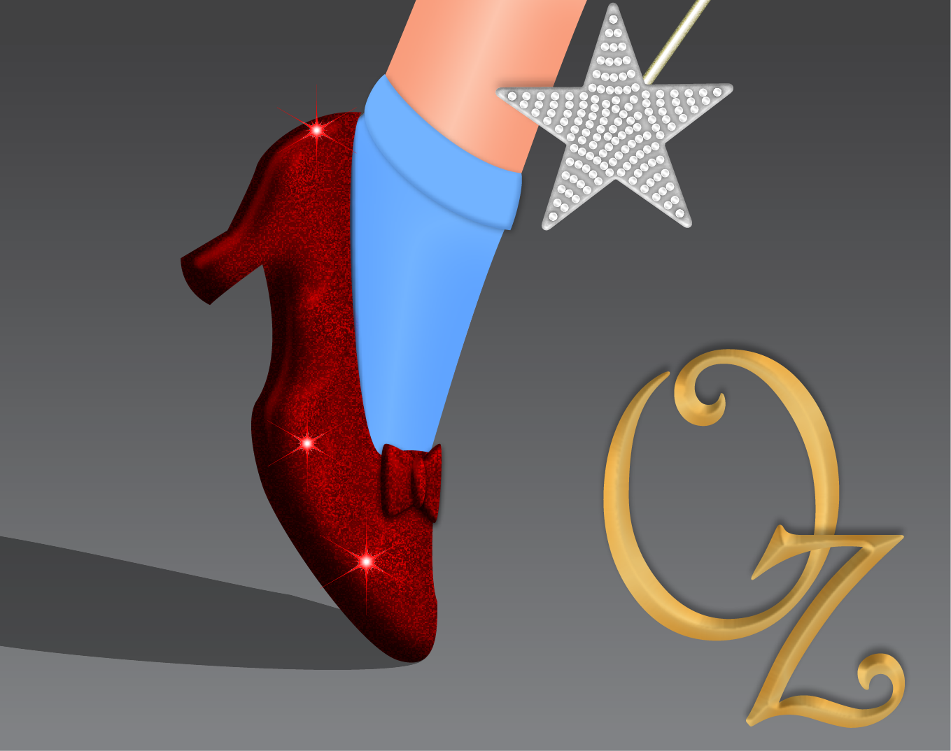
When Kelly Vaughn asked me if I wanted to do a ruby slipper effect for InDesign Secrets to celebrate the Wizard of Oz’s anniversary, I was interested (it’s one of my top ten all favorite time movies), but I wasn’t really sure I could do it justice. One of my mantras when it comes to effects is “always use the right tool for the job,” and this one seemed to be a Photoshop or Illustrator job. But then I figured I’d give it a try anyway, just to see what I could come up with. I ended up being fairly pleased (this is InDesign after all), and I think it was worth the exercise to illustrate some effects techniques you can put to use in other projects. So here’s how I did it.
The shoe
I started by just Googling “ruby slippers” to find a reference photo. I used the Pen tool to trace the shoe outline and the shapes of the bow on the shoe. I filled them with red and applied Inner Shadow, Inner Glow, Bevel and Emboss, and Satin.
Note: if you want to see the exact settings used for each effect, download this snippet file, place it in an InDesign document, select the item you’re interested in, and look in the Effects panel.
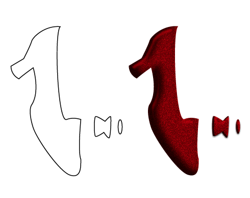
The key to creating the glittery texture of the shoe is to use Noise in the Inner Glow. I used a huge amount (50%), colored red and set to Multiply to blend the chunks of noise with the fill of the shoe shape.

In fact, that noise was the only reason I added the Inner Glow. So keep that in mind if you ever want to add a glittery or sparkly texture to something in InDesign. Noise is the secret ingredient.
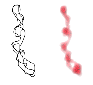
To vary the vary brightness of the glitter on the shoe and give it a more rounded feel, I created some irregular shapes and blended them with the shoe shape. I started by drawing some squiggly shapes with the Pencil tool. I filled them with red and set the blending mode to Overlay to increase the contrast. Then I applied Inner Glow, Bevel and Emboss, Satin, and Basic Feather effects similar to what I used in the shoe shape.

Next, I added a cast shadow under the shoe. I copied and pasted the shoe shape in place, removed all effects, set the fill to 40% black and set the blending mode to Multiply. Then I dragged with the Shear tool to make the shadow shape and deleted the parts I didn’t need.

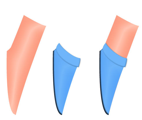
The leg and sock
Like the shoe, I traced the leg and sock shapes from a photo with the Pen tool.
I filled the leg shape with a color that was close to Dorothy’s skin. For a starting point, you can sample colors from a photo with the Eyedropper tool, and then save them as swatches. Tweak as needed to get the colors you want.
I applied Satin to give the leg a rounded look. And I filled the sock shapes with a blue color and applied Inner Shadow and Satin. Again, check the snippet file for the exact settings used in each case.
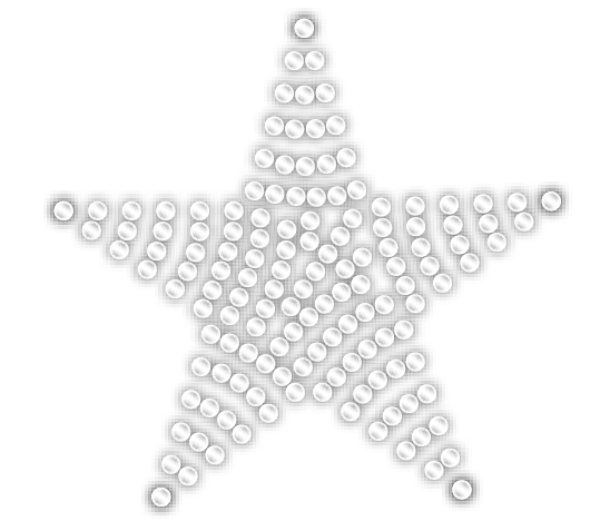
Glinda’s Wand
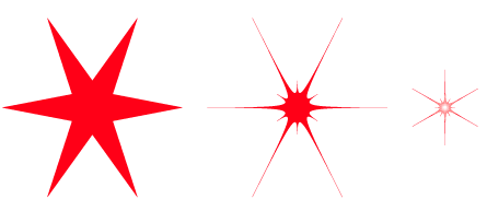
For the Star, I started with a polygon 300 px in width and height, with 5 sides and 50% Star Inset. I filled it with 20% black and added Inner Glow and Bevel and Emboss effects. To get the glittery fill, I went to General preferences and selected Adjust Scaling Percentage, and then scaled the star down to 25%.
It was key to start with a star that was too big and use the Adjust Scaling Percentage preference, because that scales the bevel and the chunks of noise down to a tiny size. I wanted a flat glittery star, not a puffy noisy star.

For the jewels on the star, I used a lot of small circles, filled with white, plus Inner Glow, Satin, and Drop Shadow effects.
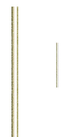
For handle of the wand, I started with a rectangle and used a linear gradient fill instead of an effect to make it look rounded like a cylinder.
Sometimes it’s just easier to do it that way since you can add as many color stops as you like to the gradient, and tweak their positions precisely until you get the look you want.
Just like I did with the star, I made the rectangle too large on purpose, added an Inner Glow with a lot of noise, and then scaled it down to 25% to get small, glittery noise chunks.
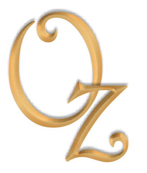
The lettering
For the lettering, I used the font Harrington and filled the text with a gold color.
I wanted the shadow of the z to be on top of the O, so I converted the type to outlines and released compound path (making the O and z separate objects). I moved the z over the O and then applied Drop Shadow, Bevel and Emboss (with the Chisel Hard technique), and Satin effects.
Flashes of Brilliance

Finally, to add some flashy reflections off those brilliant rubies, I created a polygon 75 px in width and height, with six sides, and 70% Star Inset. I filled the shape with red and ran the Path Effects script that comes with InDesign. You can find it in the Scripts panel, in Application > Samples > JavaScript.
In the script’s dialog box, I selected the Punk effect with 10% Offset. I also scaled the shape down to 60%, rotated it 90 degrees and applied Inner Glow.
I also set the blending mode of the shape to Hard Light. Be advised, Hard Light is one of InDesign’s blending modes that works better when you use RGB Transparency Blending Space. It doesn’t mean you can’t use this effect in print, it just means you have to flatten and convert to CMYK after you export from InDesign.
Finally, I made some extra copies of the shape, and dragged them into place.
Star Shadow

To cast a shadow of the star on Dorothy’s leg, I copied the star shape (just the star’s outline, not all the jewels) and pasted it in place. I added a drop shadow, then cut the star shape and pasted it into the leg. That way, the shadow appears only on the leg and not on the background or anything else in the picture. This technique of using Paste Into to mask objects is one of your best secret weapons for making InDesign effects.

To finish the effect, I took everything, grouped it, pasted into a new frame and filled that frame with a dark gray gradient.
At least, I think that’s what I did. Maybe it was all just a dream. But it was so real! Auntie Anne-Marie was there? and David was there? and you? and you? you were there!
OMG. Awesome. AWESOME!
For anyone who wants to see more InDesign Effects brilliance, check out Mike’s videos here: https://bit.ly/NF9jCm
Thanks, David :)
VERY cool! I especially like the irregular shape giving a random highlight to the shoe.
But you do know that the originals in the book were “silver shoes” not “ruby slippers.”
The story is that the filmmakers changed them from silver to ruby so they were show up better in the new Technicolor process for the film.
So cool, Mike! Thanks for doing an Oz article with me. :)
Sandee-
Interesting!
Kelly-
Thanks! And thanks for coming up with the idea. It was fun :)
The wizard of oz is all about the us monetary system. With the oz being for ounces of gold and silver. Hence the silver slippers, the gold road and the banker being much more powerful than he really is.
The straw man is agriculture, the tin man manufacturing, needing financial liquidity (oil).
Anyway, I could go on, but you might see the movie in a different way with a new understanding…
Very VERY helpful! Instructions made very easy :) I appreciate your help!
Loved the “Slippers” Can’t wait to create something of my own from this lesson.
Thanks for the input!